Double-Gate Booklet
Project type
Layout
Date
October 2024
Tools
Figma, Indesign
Overview
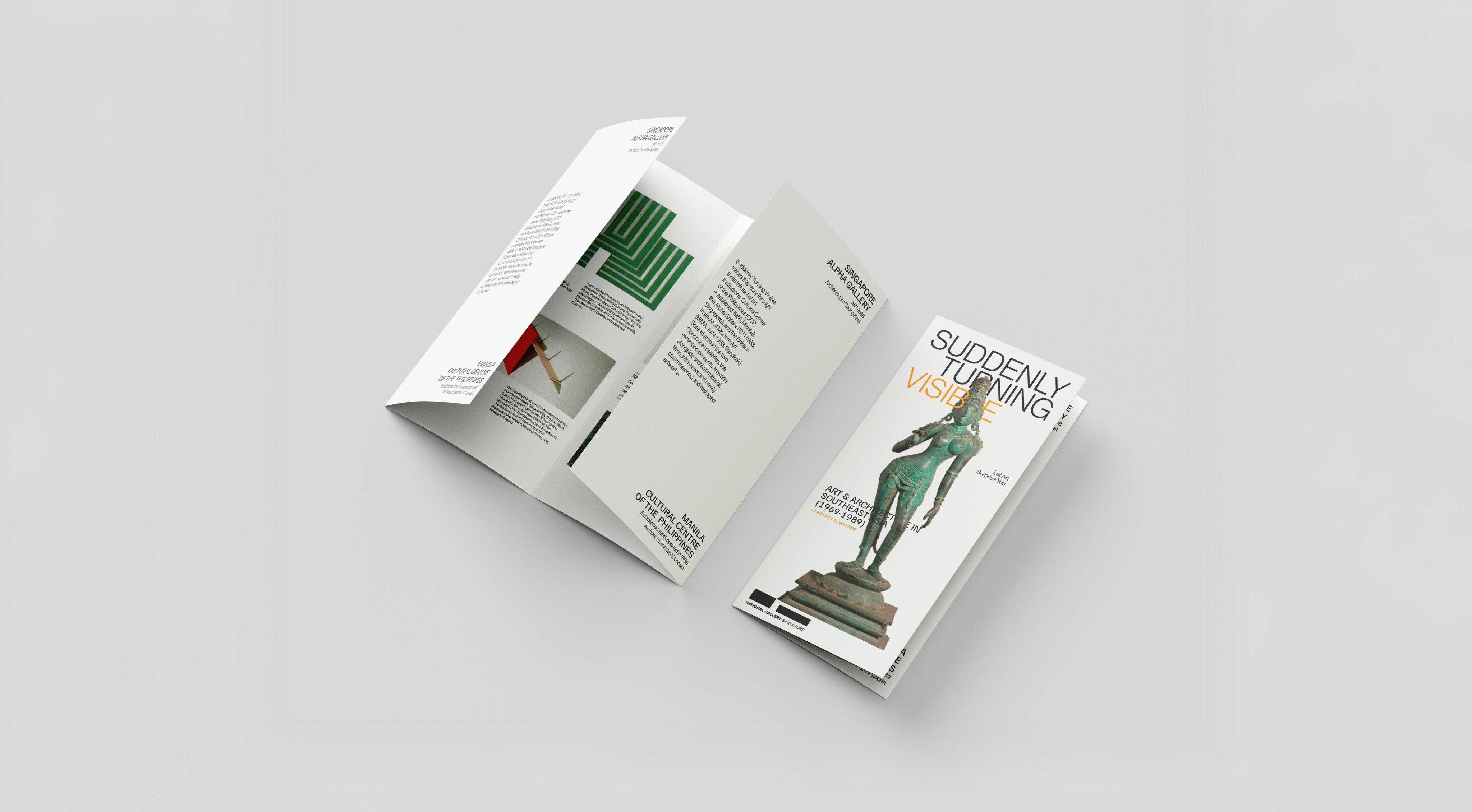
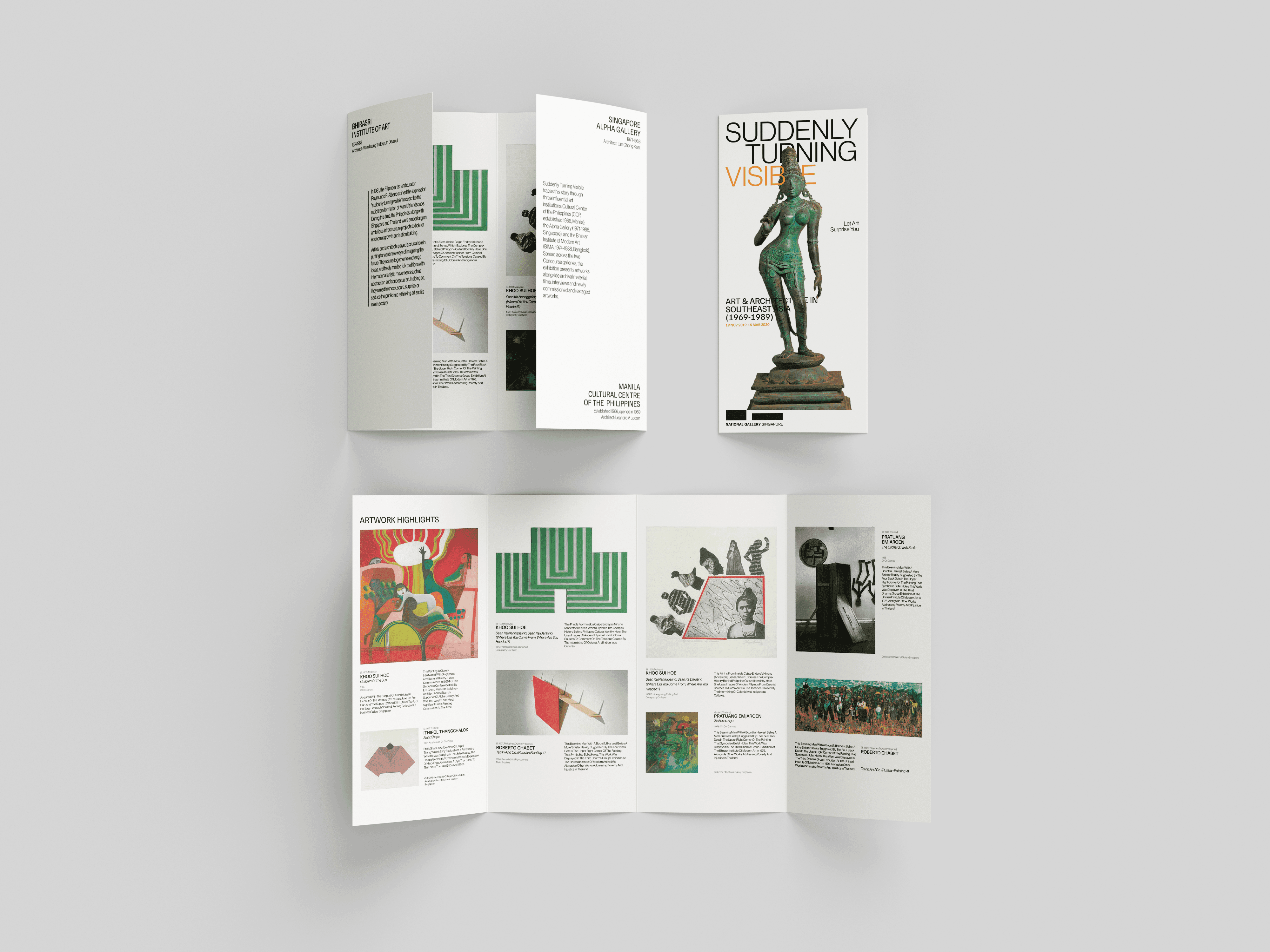
In this project our goal was to practice layout on double gate from existing reference "Suddenly Turning Visible"
There are following specifications:
Format (Closed)
98(w)X210(h)mm
Format (Open)
392(w)X210(h)mm
Colors
Colored
Images
Allowed
Font
Two
*Refer images below for references
Reference
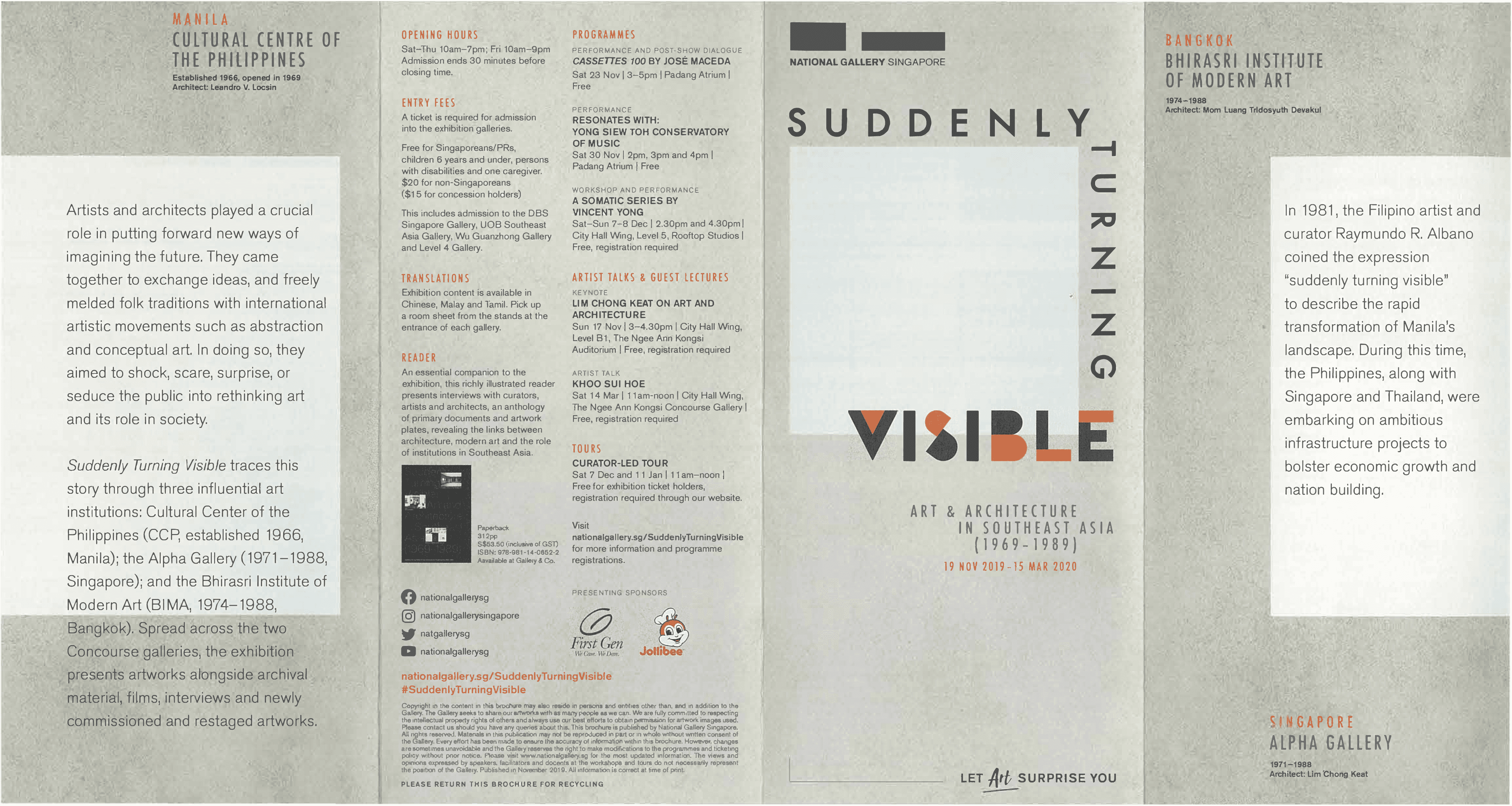
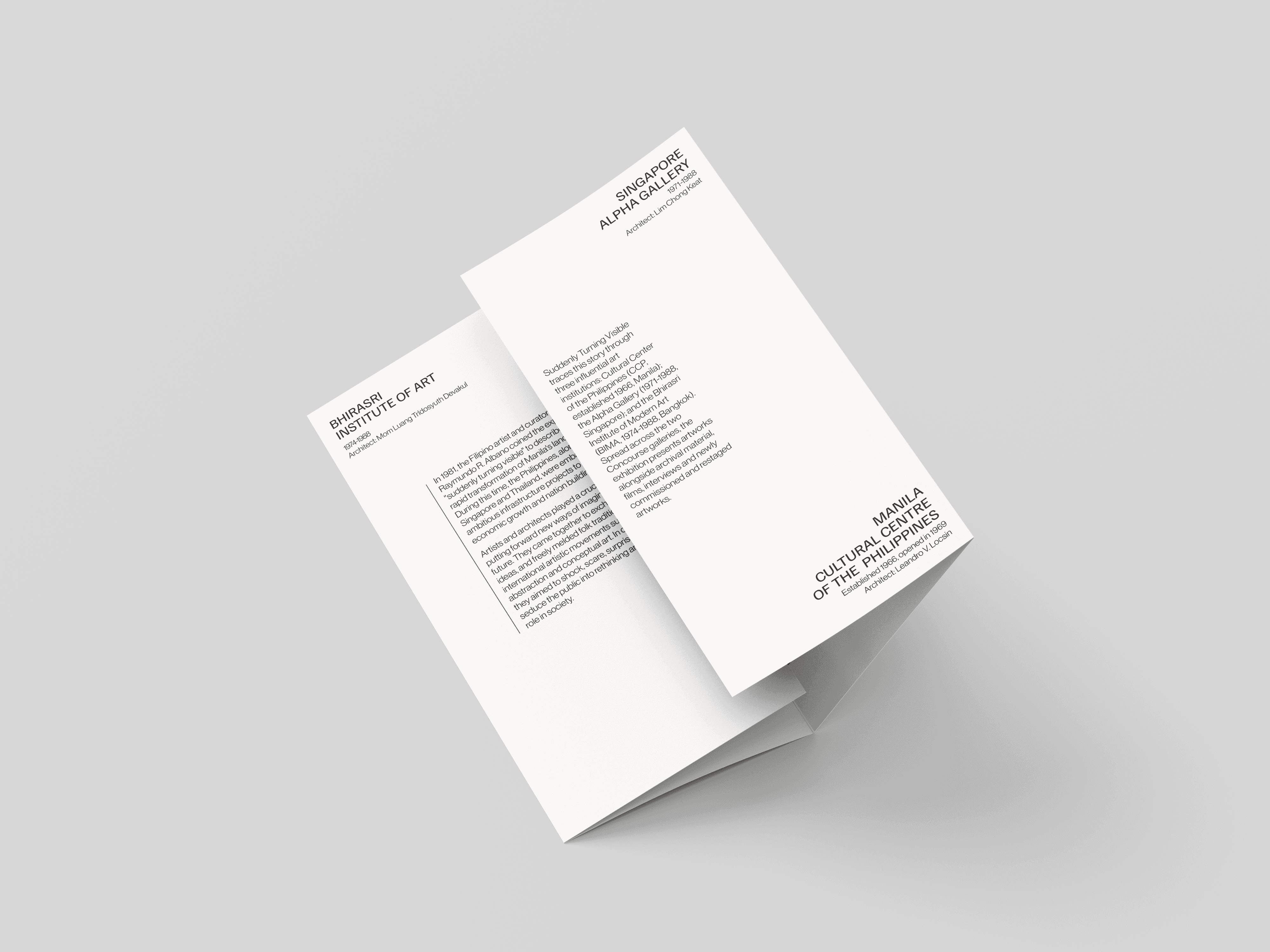
Front/Back
For the front, I decided to do something more interesting while keeping it minimalistic. I used a photo of the statue from the same exhibition and placed the text on the front and back of the statue. This way, I played around with the title "Suddenly Turning Visible" by giving depth to both the statue and the text.
For the grid, I used the 4 columns grid, similar to the bi-fold project. However, this time it is not referenced from swiss grid style. The are several reasons behind the 4
column grids:
Click here to collapse
On the back, I divided the information into two halves. I decided to equalize the information by having the same weights on both halves. I separated the information with and without sub-headers. While equalizing the two halves with the same weights made it cleaner, there is also the issue that the body text sizes on the two halves are now different. Without proper testing, I cannot evaluate which one is better, which is why, for now, I left it as it is
As you may notice, I placed the map behind, and I will explain my decision later.
Grids Off

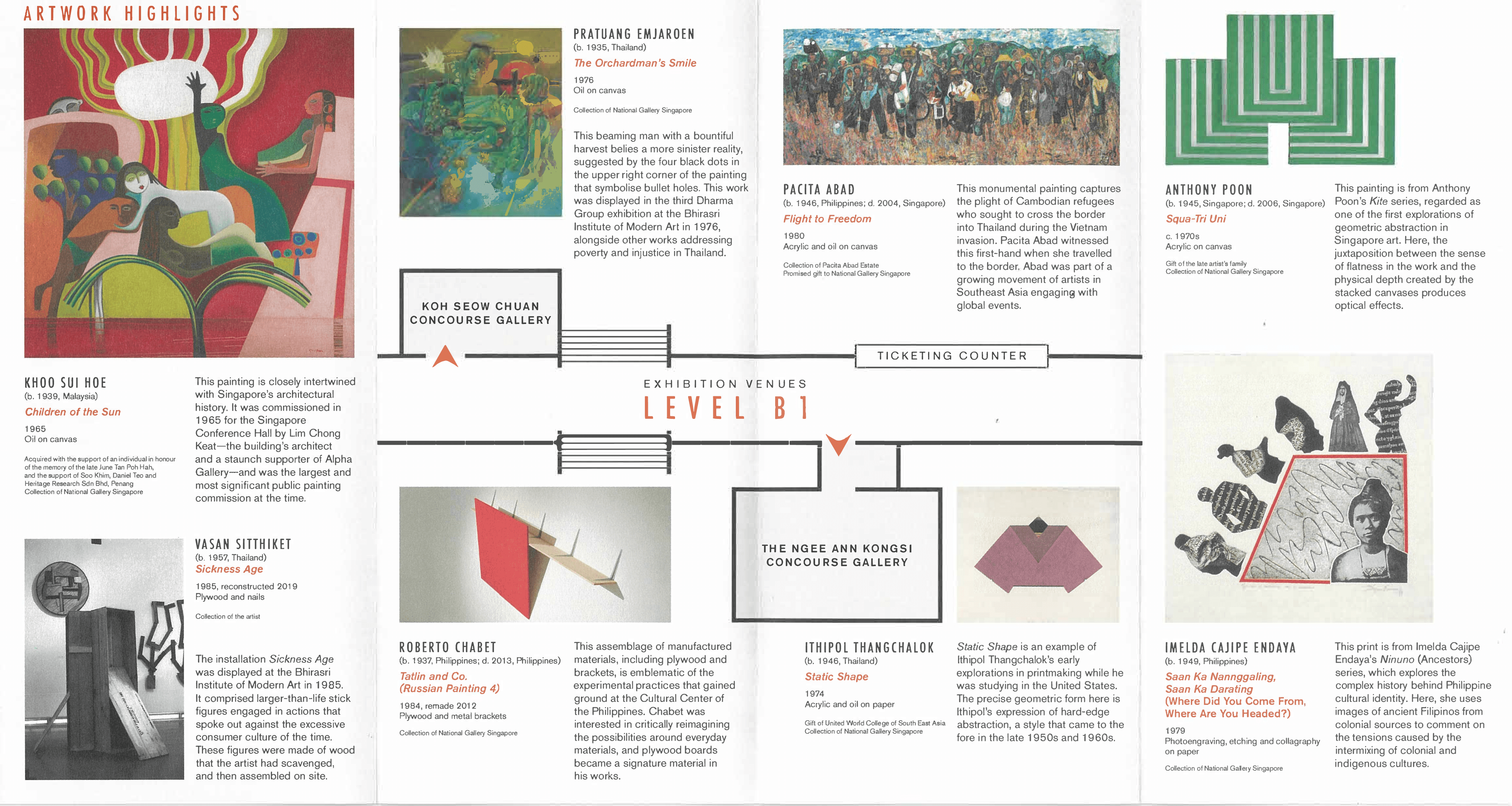
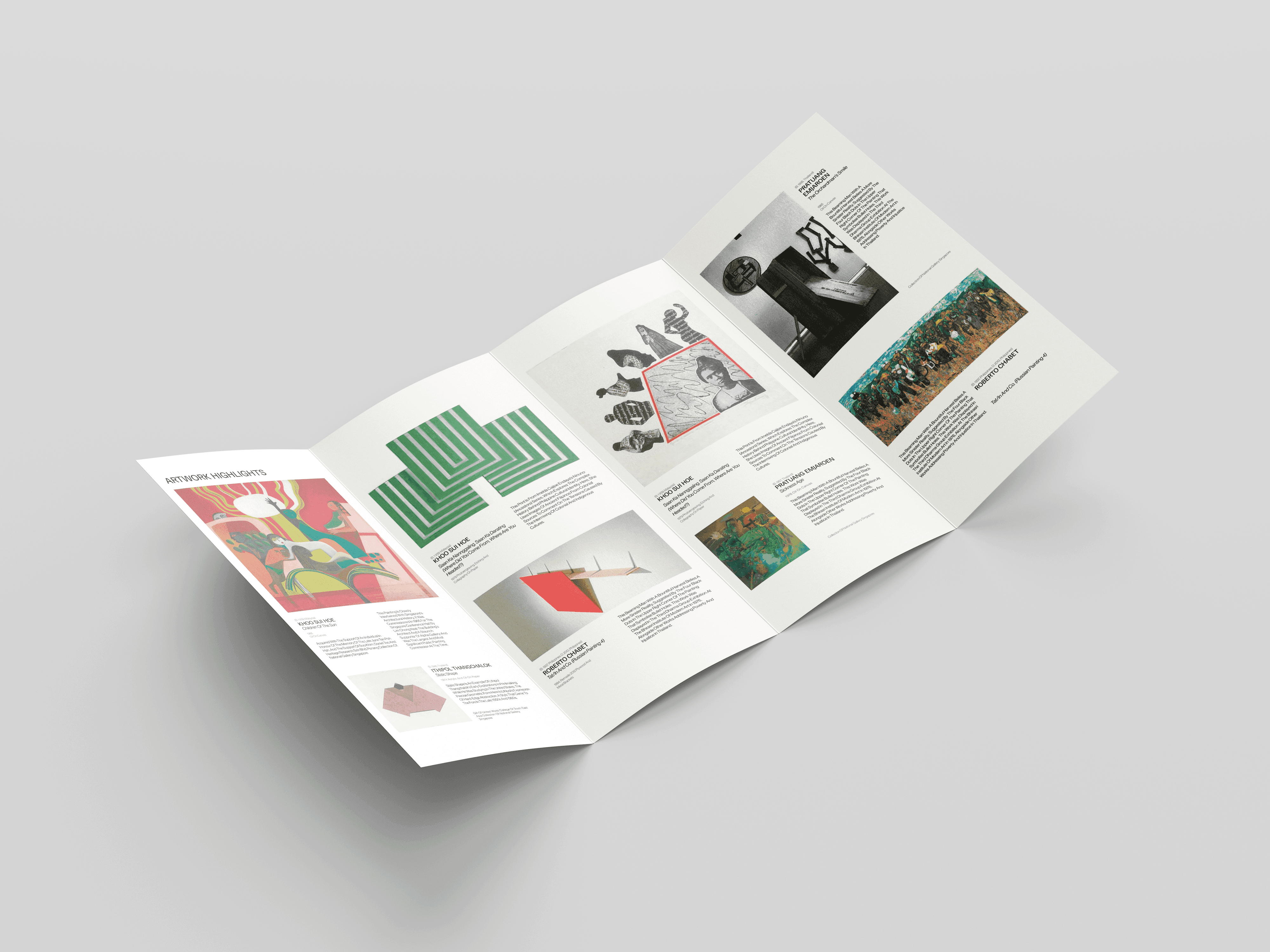
Artwork Highlights
The most important part is the Artwork Highlights. As mentioned before, I decided to remove the map from this part
Here are several reasons:
Click here to expand
My main method of doing the layout was to imagine everything as puzzle pieces. If we highlight the images with the text, we can see that it actually looks like a rectangle. Instead of trying to fit everything right away, I made a layout for each artwork separately. After finishing everything, I put the pieces back together to fit into one big rectangle. Of course, it’s hard to make it an ideal rectangle, but I made sure that, at the very least, it looks as close as possible.
Grids Off
Grids On
Grids On + Content Visualisation

Final Designs
Reflections
While working on the Double-Gate Fold brochure, I learned how to work more effectively. This project was assigned right after completing the Bi-Fold Booklet. During this short period, I managed to take away key lessons on working smarter and more strategically
For example, while designing the Artwork Highlights, I demonstrated the ability to structure the design process by treating each artwork and its content as individual rectangles, and the layout as a puzzle—where the challenge is to fit everything into one cohesive rectangle.
I also learned from the mistakes I made in the Bi-Fold Booklet. Before starting the layout, I analyzed the largest and smallest content blocks and then designed the rest based on those, rather than jumping in without structure
In conclusion, as designers, it’s important to understand the content you’re working with. It’s much easier to work efficiently when you set a proper structure from the beginning, rather than dealing with a chaotic layout you’ll have to fix later
Double-Gate Booklet
Project type
Layout
Date
October 2024
Tools
Figma, Indesign
In this project our goal was to practice layout on double gate from existing reference "Suddenly Turning Visible"
*See full case study on desktop/laptop version
There are following specifications:
Colors
Any
Images
Allowed
Format (Closed)
134(w)X190(h)mm
Format (Open)
268(w)X190(h)mm
Overview
Final Designs