Bi-Fold Booklet
Project type
Bramding, UX/UI
Date
December 2024
Tools
Photoshop
In this project, our goal was to practice layout and wayfinding systems by creating a bi-fold from an existing reference of the Singapore International Photography Festival.
*See full case study on desktop/laptop version
To test our creativity, several limitations were set:
Colors
Monochrome (B/W)
Images
Not Allowed
Format (Closed)
134(w)X190(h)mm
Format (Open)
268(w)X190(h)mm
Overview
Final Designs
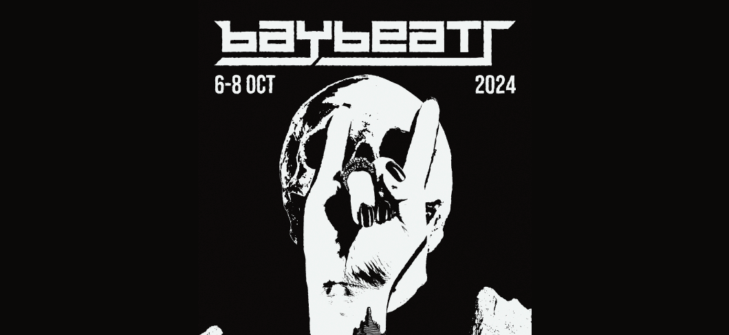
Baybeats
Project type
Branding, UX/UI
Date
December 2024
Tools
Photoshop, Figma
Partner
Aarushi Nagar
Overview
Baybeats is an annual alternative rock festival, with its design direction changing across different iterations. Our goal in this project was to create and direct a new iteration of Baybeats, working in teams of two
Following Deliverables:
•A series of minimum 3 promo posters
•1 festival mobile site
•1 festival brochure/catalogue
•3 adaptation of festival on-site graphics
•Other misc. festival application
*Do note that not every deliverable has been done by me.
I will go in-depth only the ones that I did
Research
Before beginning the design, it’s important to work in context. That’s why, before creating a direction for the design, I conducted research to understand who I’m designing for and what I’m designing
Who are the organisers?
Click here to expand
How is it different from other regional festivals?
Click here to expand
Are there thematics that shape the festival?
Click here to expand
Apart from the basic research, I also looked into on-site graphics. To be honest, I’m not the type of person who usually attends music festivals, so I had zero knowledge of how on-site graphics are executed. However, I had a rare opportunity to visit Baybeats in October. That experience allowed me to truly feel the atmosphere of the festival and observe how the on-site visuals were brought to life
Reflection from research:
Click here to expand
First Iteration
Goth Ver.
Raw Visuals
Metal
Punk
Goth
Indie
Rock
First Iterations
During this project, I curated the visual direction and concepts for the festival. In my first iteration, I implemented the core ideas of diversity and self-expression in the Baybeats visuals by incorporating the identity of each alt-rock genre
To begin integrating the different genres, I created a central visual theme. In this iteration, it was the rock hand symbol. The idea was to showcase the wide range of self-expression within the festival, while emphasizing that through this diversity, it’s the shared love for rock that unites us all
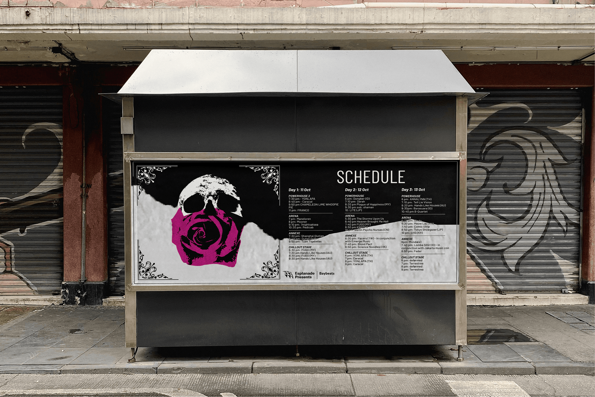
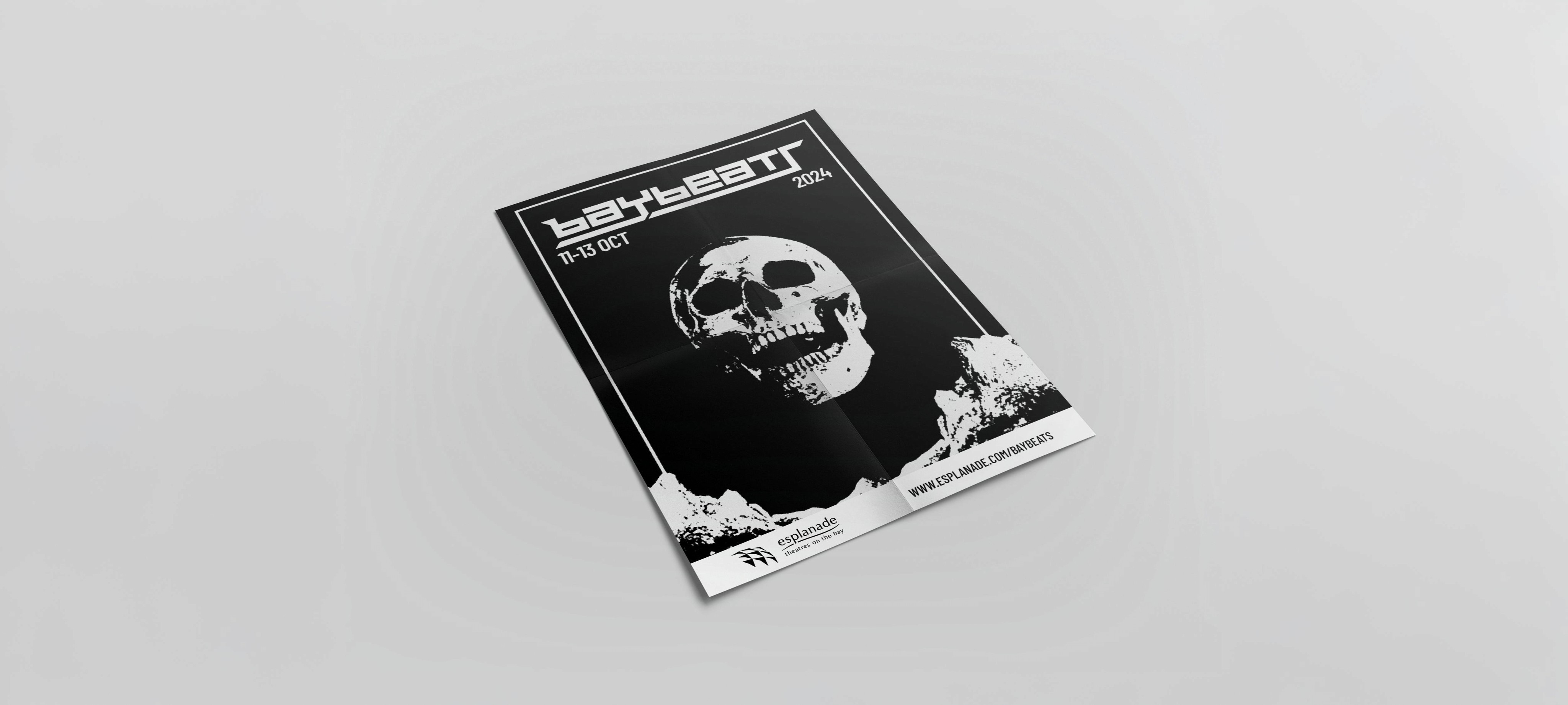
Another idea was to give the audience the power to interact directly with Baybeats by tearing apart posters to reveal visuals underneath. The posters were designed so that each element was coherent, which is why the core visuals were so important
To reflect the different alt-rock styles, I redesigned the logo for each genre while maintaining the structure of the original. I kept the same blocky font and added genre-specific visuals on top, allowing each version to stay consistent while visually representing different rock subcultures
Second Iterations
For the second iteration, I decided to refine my key visuals. The previous concept felt a bit too stereotypical, and some might even consider it "cringe." This time, I aimed to make the visuals less straightforward and more unique by introducing a theme of circular objects that align with each genre
With this approach, when someone tears the poster, they reveal a continuation of the circular object underneath, creating an interesting visual effect—especially when there's strong color contrast. Another key visual element is the set of graphics placed at the bottom of the poster, which complements the overall composition
Direction
For the final direction, I ended up following the second iteration. However, the biggest difference is that this version was designed with proper context in mind. In this case, the context is that Baybeats is part of Esplanade, and therefore needs to follow Esplanade’s guidelines.
For example, in the punk poster, the original Statue of Liberty visual
could raise concerns about cultural appropriation. That’s why it was replaced with a more appropriate alternative before submission.
To better align the visuals with Esplanade, we also incorporated elements that indicate the project’s affiliation. For instance, an Esplanade banner has been added at the bottom of each poster.
In terms of the overall visual direction for the festival, the key unifying element is the torn effect. It’s a unique visual approach that opens up many creative possibilities. More importantly, it’s the one element that ties all the different genre visuals together into a cohesive piece.
For example, in the staff badge I designed, the torn effect runs through the middle to reveal the employee’s status.
And of course, each genre has its own distinct visual identity. Due to time constraints, we focused on three genres. I directed the visual identity for each one, drawing heavily from source materials and the actual history of the genres. Here’s a breakdown of each genre:
Metal:
Click here to expand
Goth:
Click here to expand
Punk:
Click here to expand
Posters
o make the poster interactive, I glued each sheet of paper on top of one another, attaching them at the corners. The thicker the paper, the more satisfying the tear becomes. The thickness also contributes to the overall weight, making the poster heavy enough in the center to resist wind
Following specifications of the poster:
Format
A3
Paper
350gsm, Rough Matte
Styles
Metal, Goth, Punk
Font
Barlow Condensed
Badges
For my miscellaneous festival application, I designed badges to illustrate how the current design direction can be flexible and applied to various products. The flexibility comes from the ability to apply different genres, creating a variety of visuals. For example, from 3 genres, we were able to create 6 distinct visuals. This variety can be used for different purposes, such as establishing hierarchy
At the bottom I hade added original Baybeats logo. It's crucial to not deviate from the original source and let viewers know from what logo we need to associate
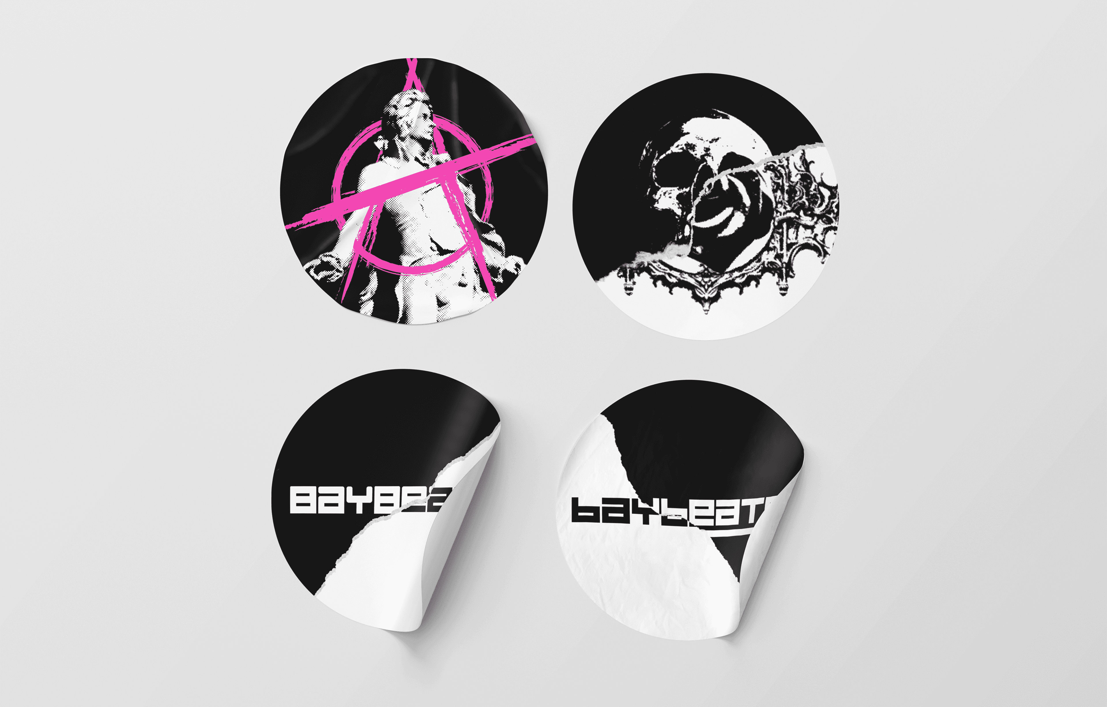
Stickers
For another misc. festival application, I created simple stickers with key visuals for each genre. The idea behind them is that they perfectly complement the overall design direction of the festival
As mentioned before, the whole concept behind the design direction is to give people a connection with Baybeats through interaction and self-expression. With these stickers, each person can either buy them to support their favorite genre or rip them in half to create their own unique sticker combination. By simply creating 6 stickers, you can make over 30 combinations!
Grids Off
Mobile Website
This is a Figma-based prototype of the Baybeats website. Originally, the Baybeats website was hosted within Esplanade, but I reimagined it as if they had their own standalone website. The design follows the direction of the festival by incorporating the tear effect as a core visual. Every hero section features a tear, each revealing its own unique image.
To maintain consistency with the festival, I used Barlow and Barlow Condensed as the primary fonts. The website is in dark mode because I felt the black background helps the images stand out.
Although it wasn’t part of the deliverables, I took the initiative to create a silkscreen t-shirt maker. The idea behind it is that users can design their own t-shirt on the website, creating a unique piece. They can visualize how their design would look, allowing them to show the staff members exactly how they want their t-shirt to appear
Get access to the prototype in this link
Other designs