Food App
Project type
UX/UI
Date
September 2024
Tools
Figma
Overview
In this project my goal was to create a working figma prototype of a food app. Here is the prototype link
There are following specifications:
Screen Size
IPhone 13 & 14, 390 x 844px.
Pages
Total of 5 pages
Font
Overused Grotesk, Inter

User-Flow
Before making design, It was essential to create an user-flow. The user-flow helps me to have better understanding of what pages to make and what functions and features, I shall add for the food-app
In this project, since we had to make only 5 pages, I kept my user-flow simple and short. Despite that, the User-Flow describes the most used and essential part of food-app, the process of ordering a food
1st Version
2nd Version
Without Grid
With Grid
With Grid and Spacing

Grids Off
Low-Fidelity
After making the the user-flow, it was important to start with low-fidelity prototype. In this flow-fidelity, my main goal was to put elements on it's places, and have a some understanding which parts belongs where before making a high fidelity app, including the approximate measurement of gaps between each elements
For the low-fidelity app, I have made 2 iterations of the search-page. The food-apps generally goes into 2 categories: horizontal and vertical scrolling. However, for my final iteration I have chosen vertical scrolling,
for following reasons:
Expand
I didn't focused much on the font, however I unsured it was placed consistently across the pages. The reason is, I didn't had the clear design direction back then, which is why choosing the font and making the final hierarchy of the font would be pointless. However, I still did a some hierarchy of the text, to see its approximate position, and made component that would change every similar text. This way, when I will be more than aware of the text, I could change it in one click
Design Systems
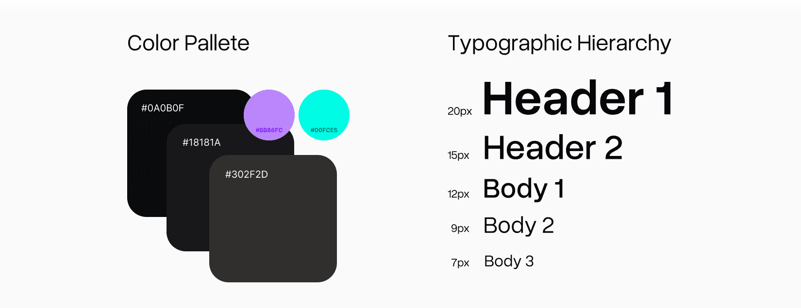
Before converting my low-fi design into high-fi, I have decided to make my app dark-mode. This is challenge for me because I have never designed app in dark-mode before
Making Dark-mode is different from designing in White-Mode. It's harder to navigate users due to lack of depth. In order to fix that, I picked different tint of black and added a hue to make it pop. The combination of different tints allows to create depth and layering in layout. In some instances, I used two different tints, the darker tint for the fill and lighter tin for the stroke
As mentioned before, every text in low-fi has been a component and after creating the typographic hierarchy, I changed the parent component
Without Grid
Heatmap
Gaps On
Grids with Spacing
Grids Off
Grids Off
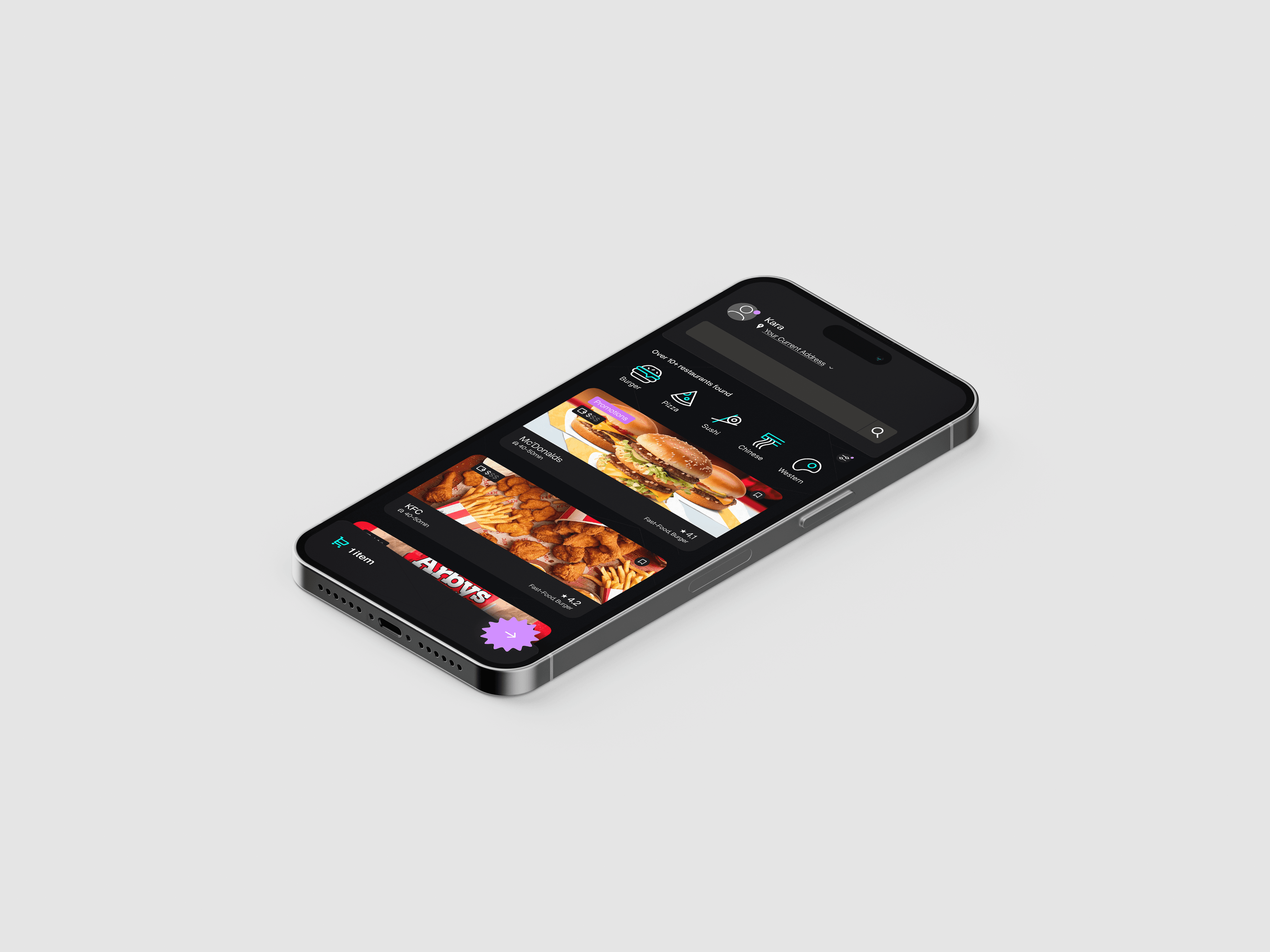
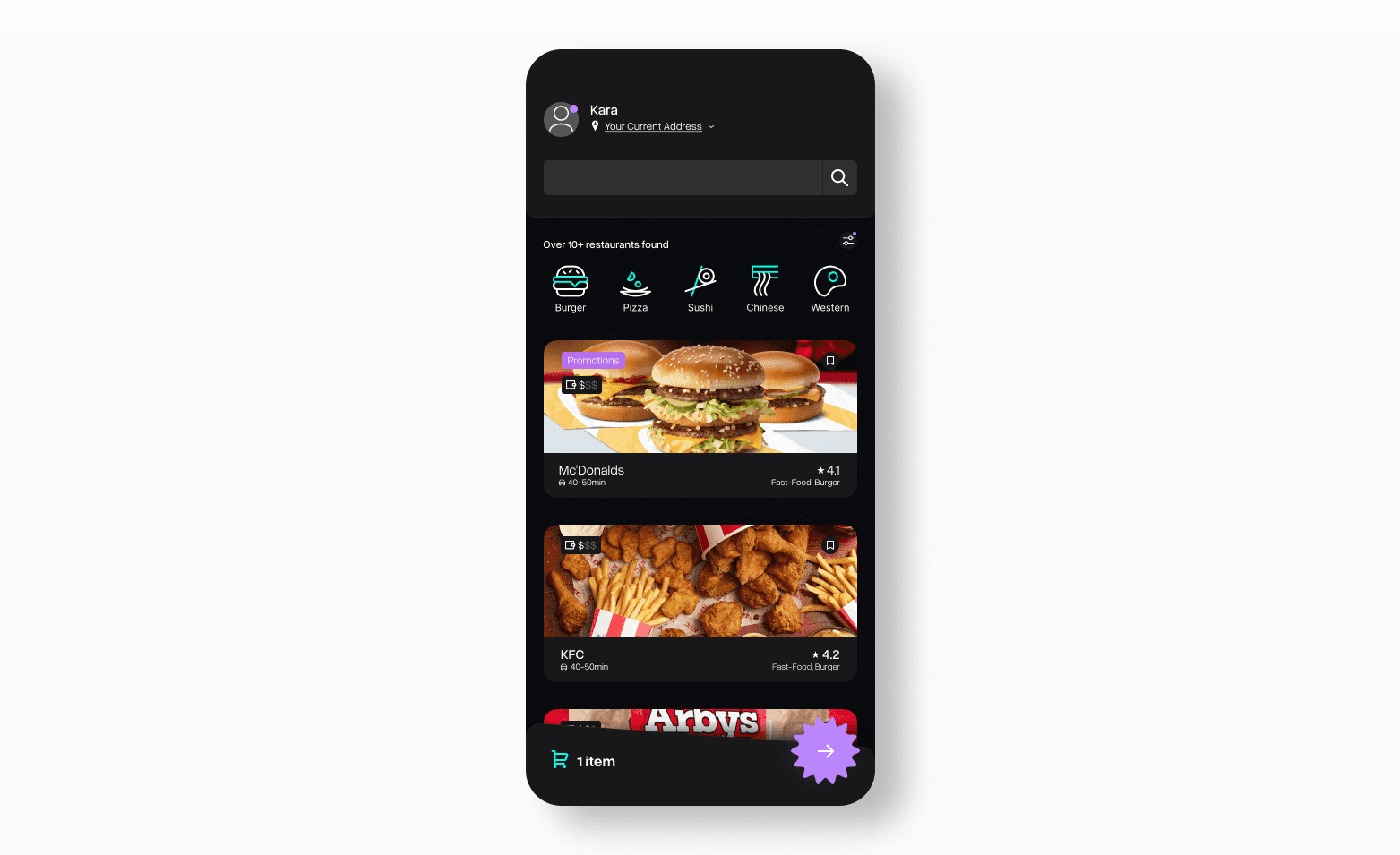
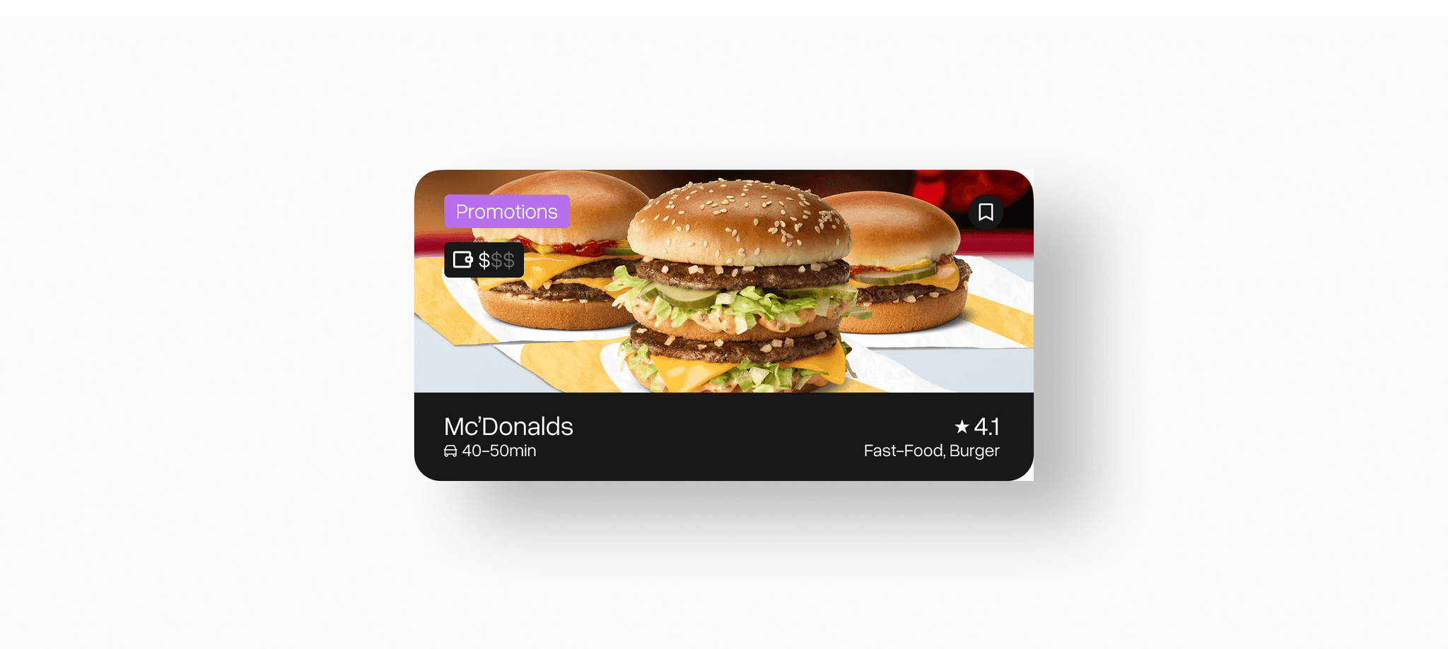
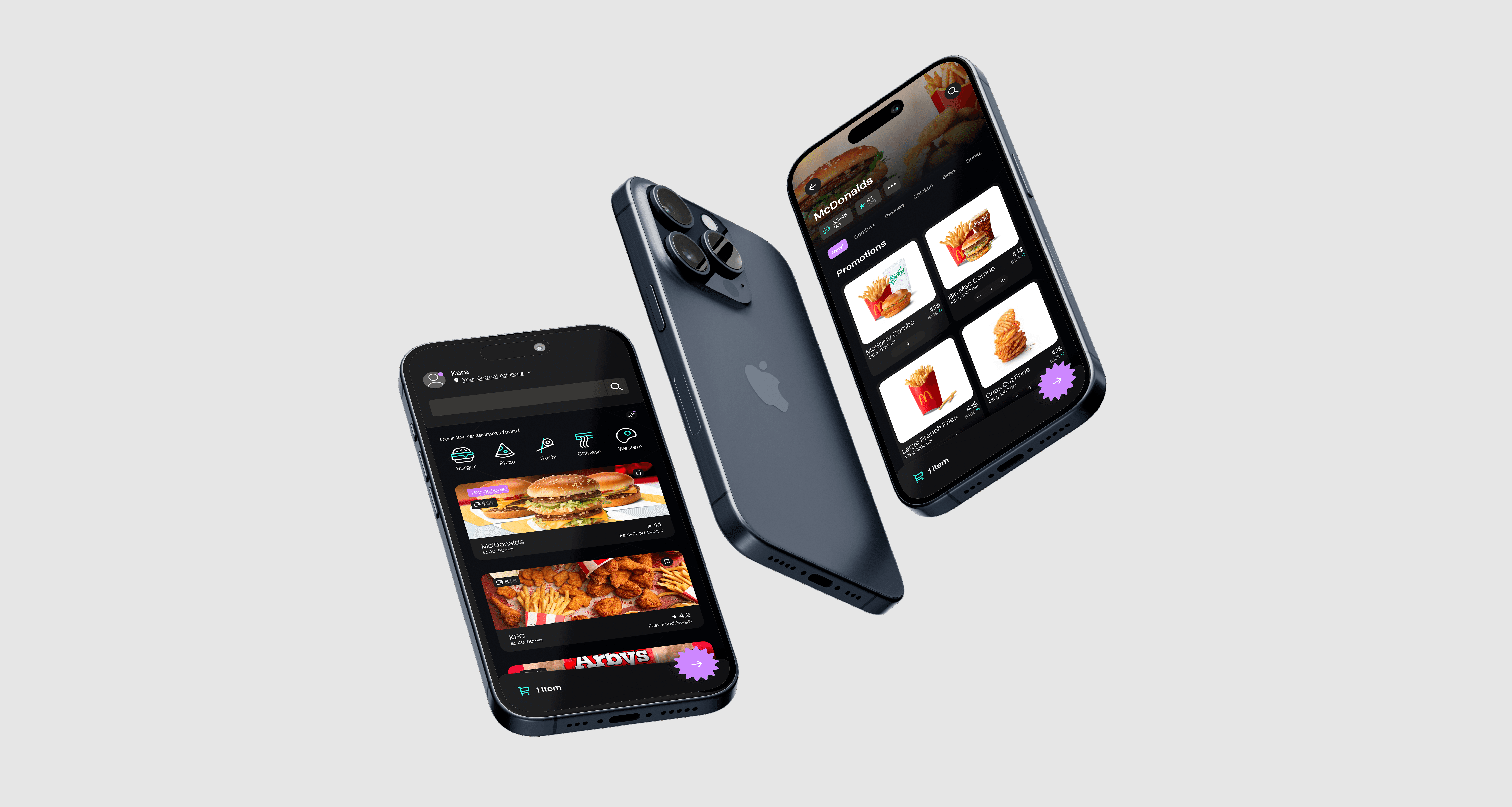
Search Page
Since the majority of the time, viewers will be visiting this page, I spent most of my effort on the search page. Let’s break down each logical grouping of elements one by one
"Header":
Click here to expand
CTA:
Click here to expand
Restraunt Container
Click here to expand
The accent colors of the app, especially in the search page are used to highlight important stuff. For example, the notification are places above your account are highlighted with purple and the promotions are highlighted with purple as well. The cyan is used primarily to show secondary information, which is not quite as essential but important as well. For example: it used in icons to note make them blend with background, or the cart is colored in cyan to remind them on the quantity of the items
Lastly, after converting my low-fi into high-fi, I made my gaps consistent and calculated as well as finalized the hierarchy of the text
Without Grid
Heatmap
Grids On
Grids with Spacing
Restaurant/Selection
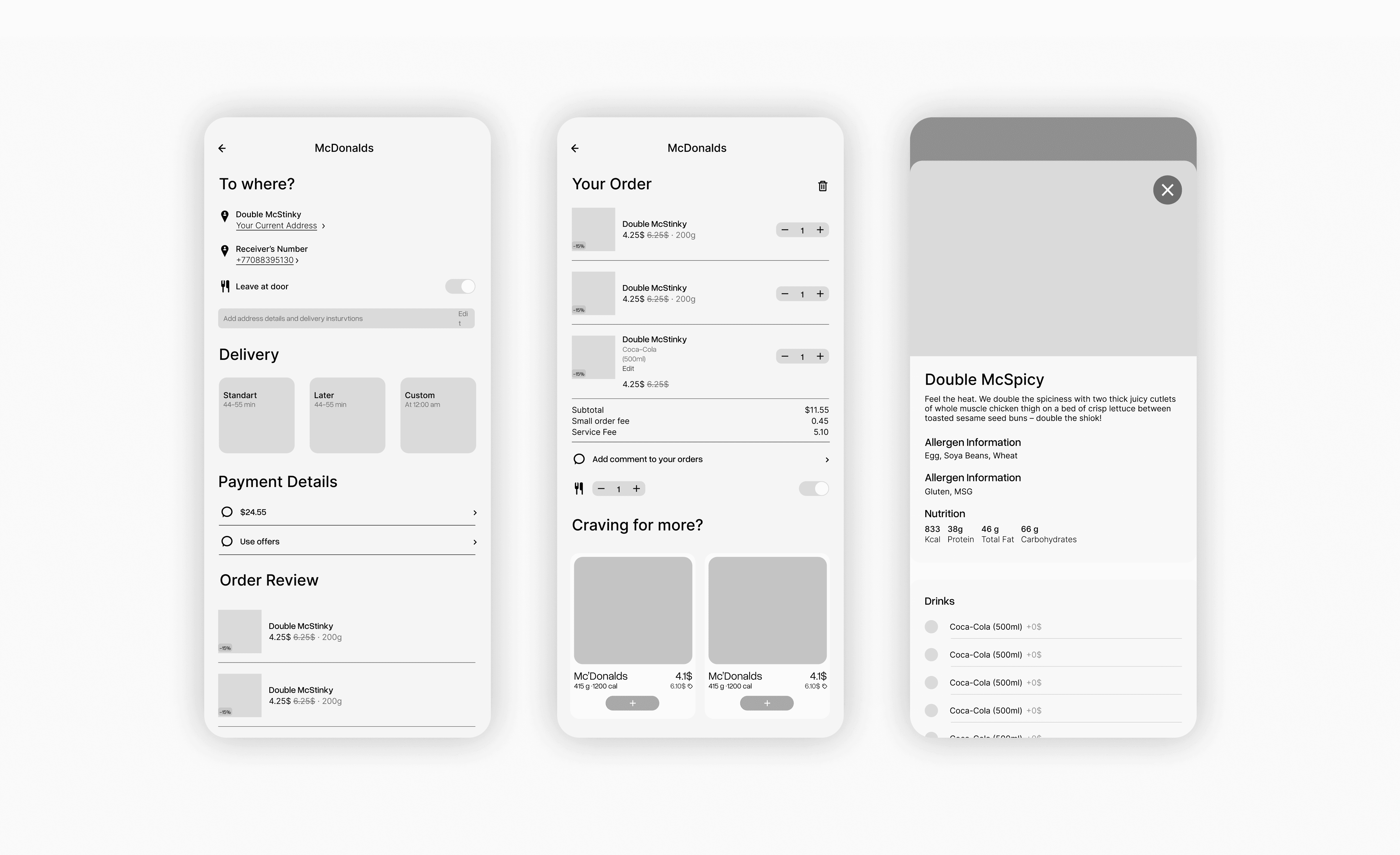
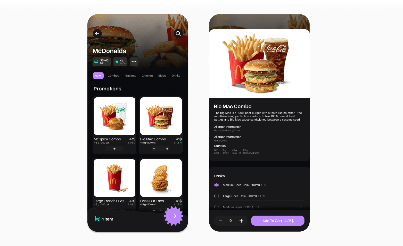
Next, I designed the page when you order inside of a restaurant and when you tapped into the order. They are very similar to each other, which is why I grouped them together. Both of the pages and the future will be following the same grid, corner radius, font hierarchy, and spacing.
Let's talk about each element and function of this page
Restaurant Page:
Click here to expand
Food Selection Page:
Click here to expand
Without Grid
Heatmap
Grids On
Grids with Spacing
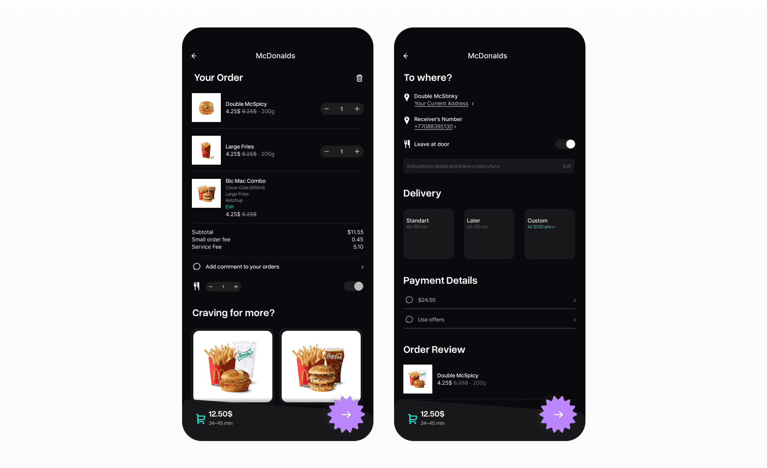
Basket/Payment
Next, I designed the basket and payment pages. They are very similar to each other. However, it's the right question to ask why I didn't unify them into one. It's common practice to let the user double-check the basket before making the order. They also serve different functions apart from each other. The basket is a place where the user can see what they have, and payment is the final step
Yet again, let's talk about each element and function of this page
Basket:
Click here to expand
Payment:
Click here to expand
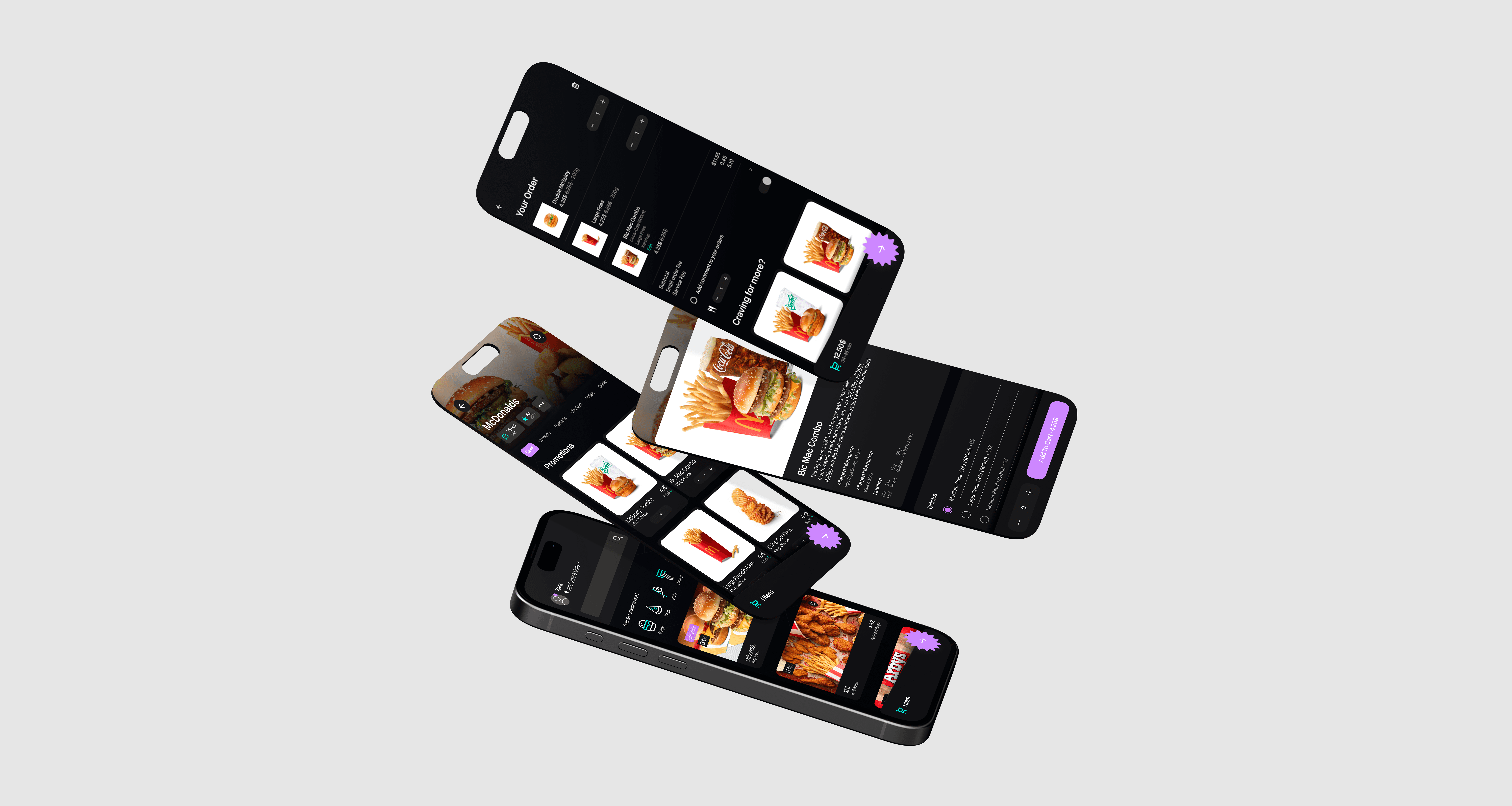
Final Designs
Reflections
This was first mobile UX/UI project. Making Food-App project helped me to practice my UX/UI skills and taught me how to work effectively. During this project, I started to utilizing components more often. That way, I had saved quite a lot of time and resources. This helped me to develop a more methodical approach for my future works
Food App
Project type
UX/UI
Date
September 2024
Tools
Figma
In this project my goal was to create a working figma prototype of a food app. Here is the prototype link
*See full case study on desktop/laptop version
There are following specifications:
Screen Size
IPhone 13 & 14, 390 x 844px.
Pages
Total of 5 pages
Overview
Final Designs
Search Page
Restaurant/Selection
Basket/Payment