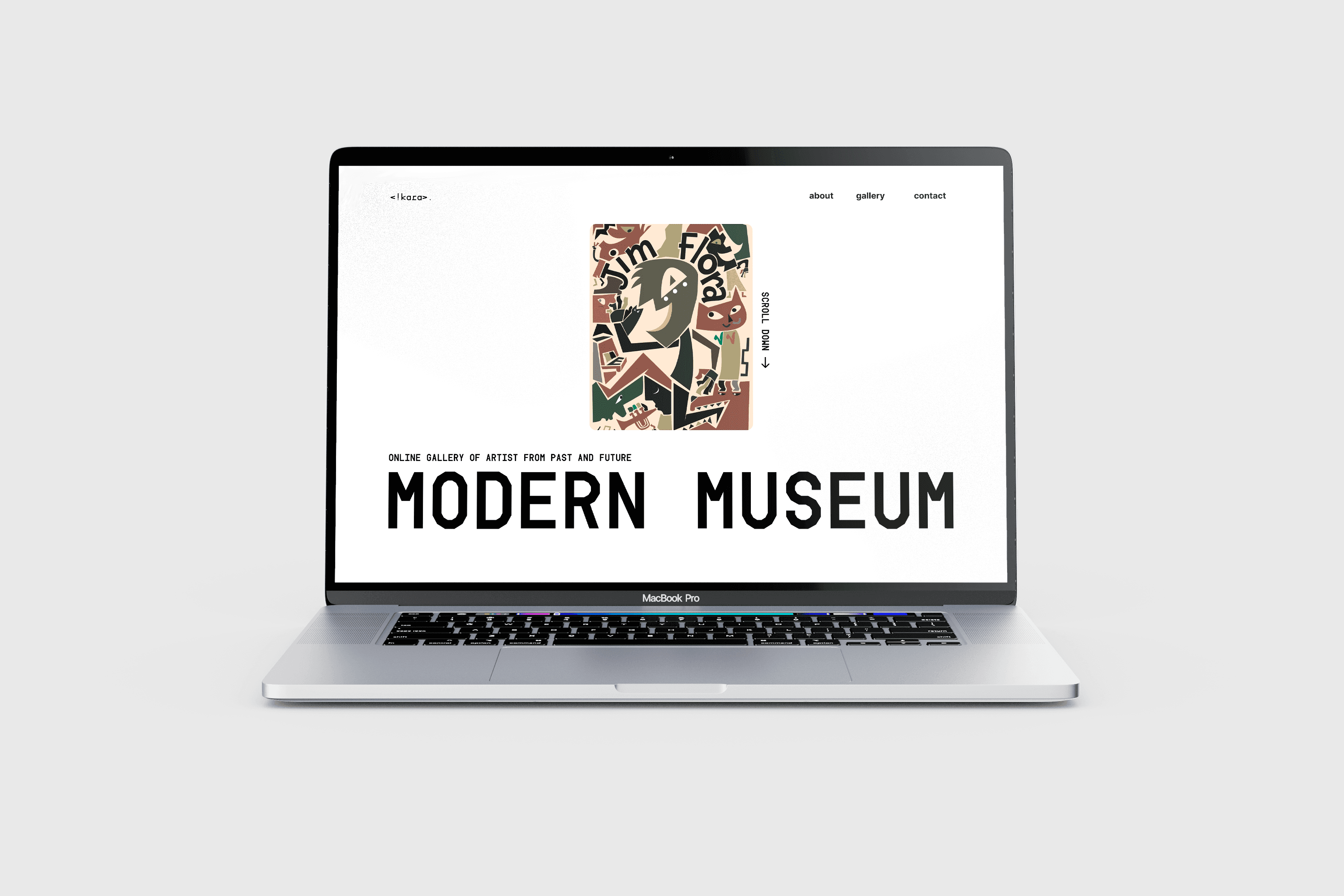
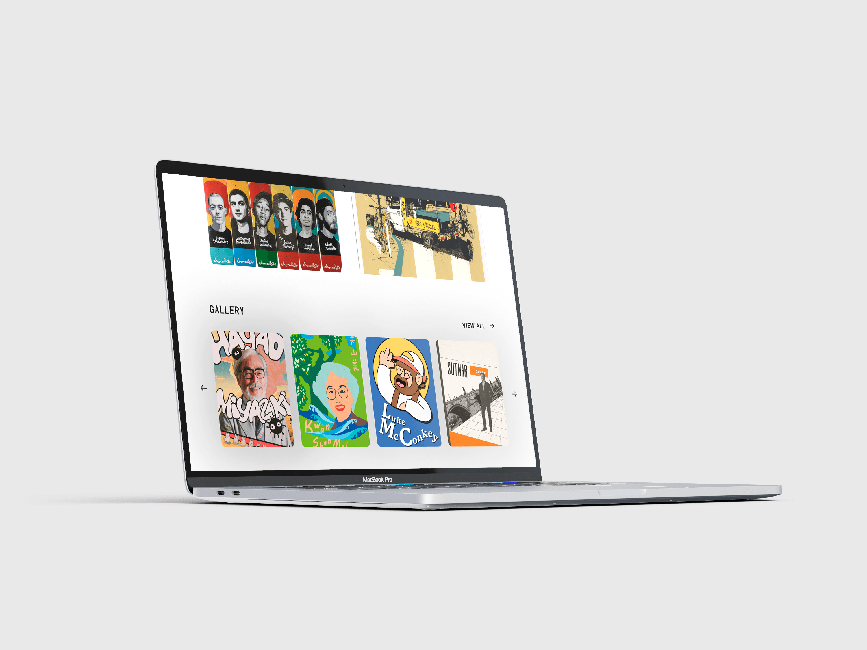
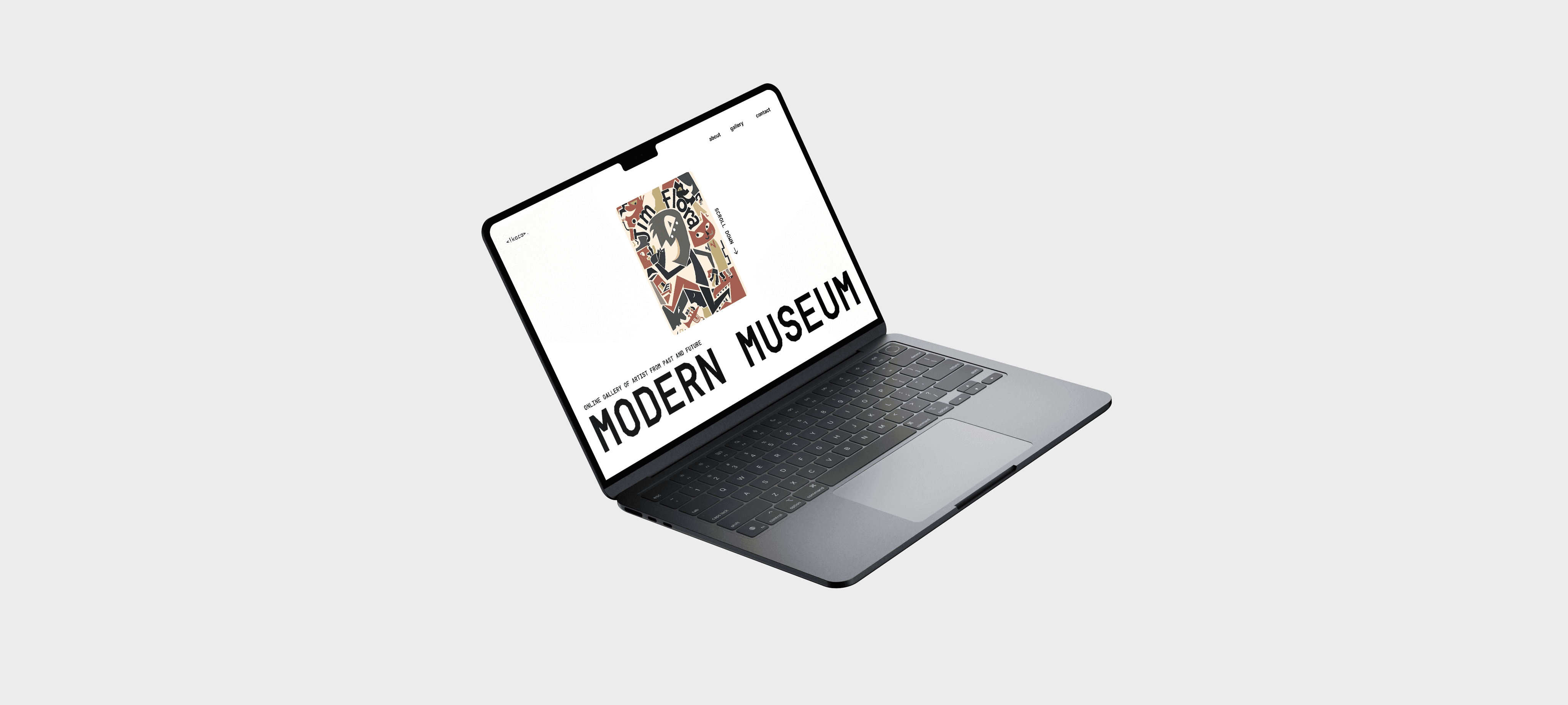
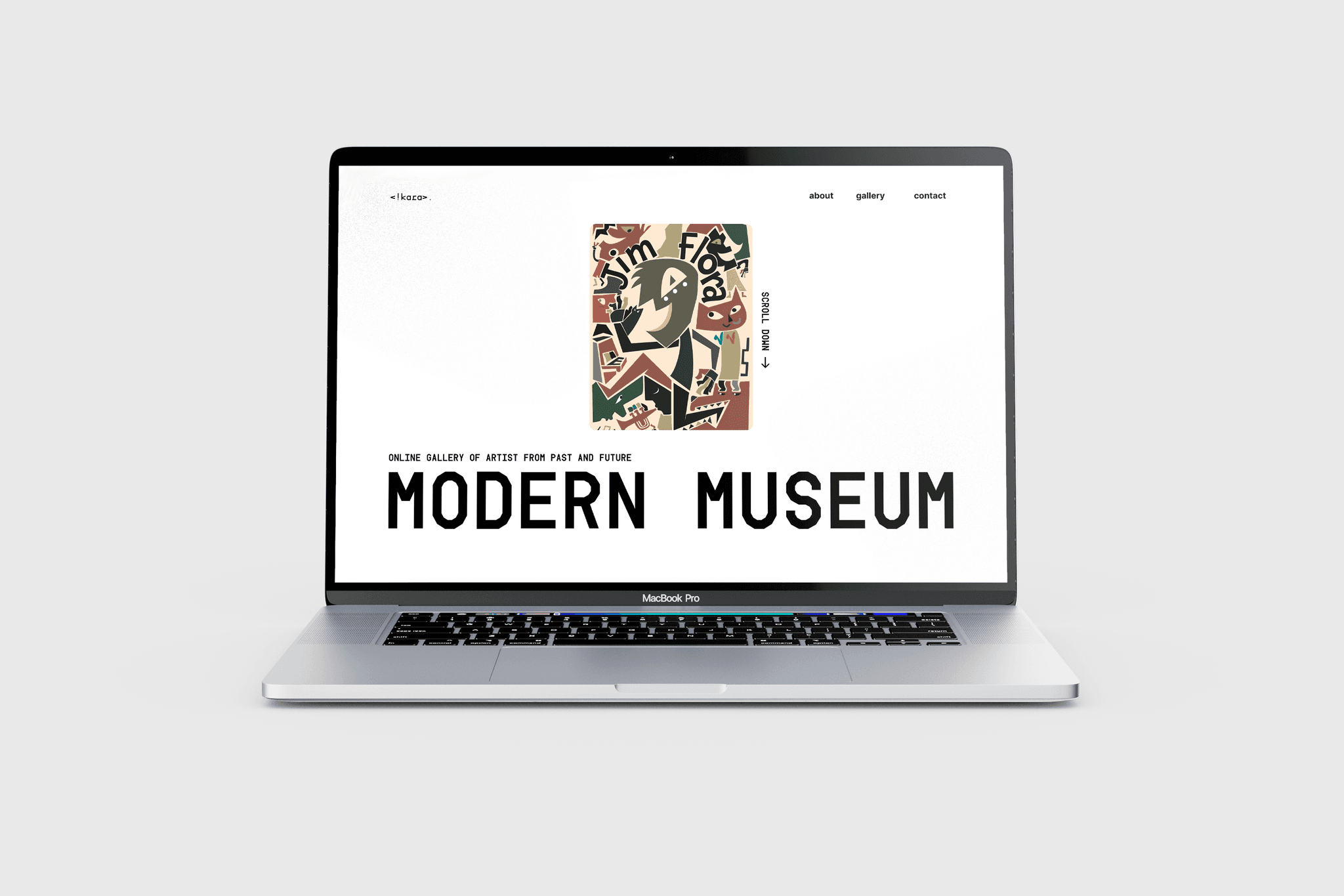
Modern Museum
Project type
UX/UI, Publishing
Date
April 2024
Tools
Figma, Procreate
Overview
In this project, our goal was not just to create a website, but to design trading cards. The premise of these cards is to honor historical designers and illustrators throughout the history of design, ranging from the 1920s to contemporary creators, by creating a card performed in their iconic style
Format (Trading Cards)
64(w)mm x 89(h)mm
Colors (Trading Cards)
CMYK, 4C x 4C
Colors (Website)
RGB
Format (Website)
1920px (width)

Site-Map
Before starting the design, it was essential to create a site map. The purpose of the site map was to illustrate how the user would navigate across different pages and give us a "helicopter view" of the website and its necessary functions. I created the site map using Figma, which allowed for quick iteration and a clear visualization of the user flow.
The site map also helped guide the flow of content and informed key design decisions by laying out how each page would connect.
For this project, since we only needed to create five pages, I kept the site map simple and concise, with only basic transitions between pages
Homepage
Gallery
Without Grid
With Grid
With Grid and Spacing
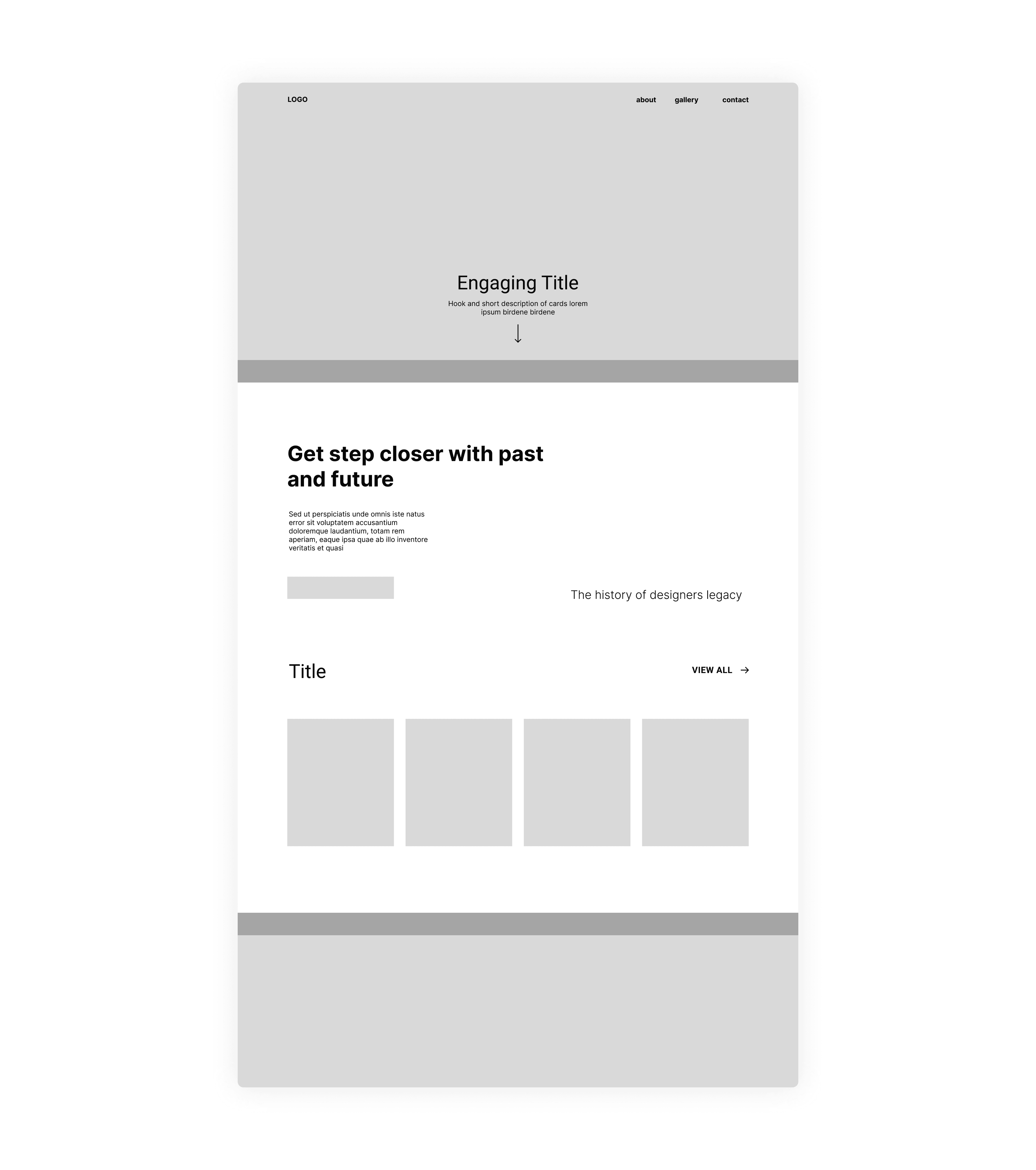
Low Fidelity
The next step was to create a low-fidelity design. At this stage, I didn’t focus much on the visual direction. Instead, I used it to roughly illustrate the approximate placement of key elements. I see low-fidelity design as the “skeleton” of my website. I used a 12-column grid system to maintain structure and consistency across sections, which helped guide alignment and spacing throughout the layout.
The wireframe begins with a minimal top navigation bar, followed by a hero section featuring a main title and a short description to hook the user. Below that, there's an introduction block paired with a supporting visual and a “View All” button that directs users to the gallery.
In the beginning, I tried to fill every bit of negative space, but by the end of the low-fi prototyping process, I began to embrace it—realizing that unnecessary visuals could distract viewers from the core content.
Homepage
Info
Gallery
Card (Front)
Card (Back)
Without Grid
With Grid
With Grid and Spacing
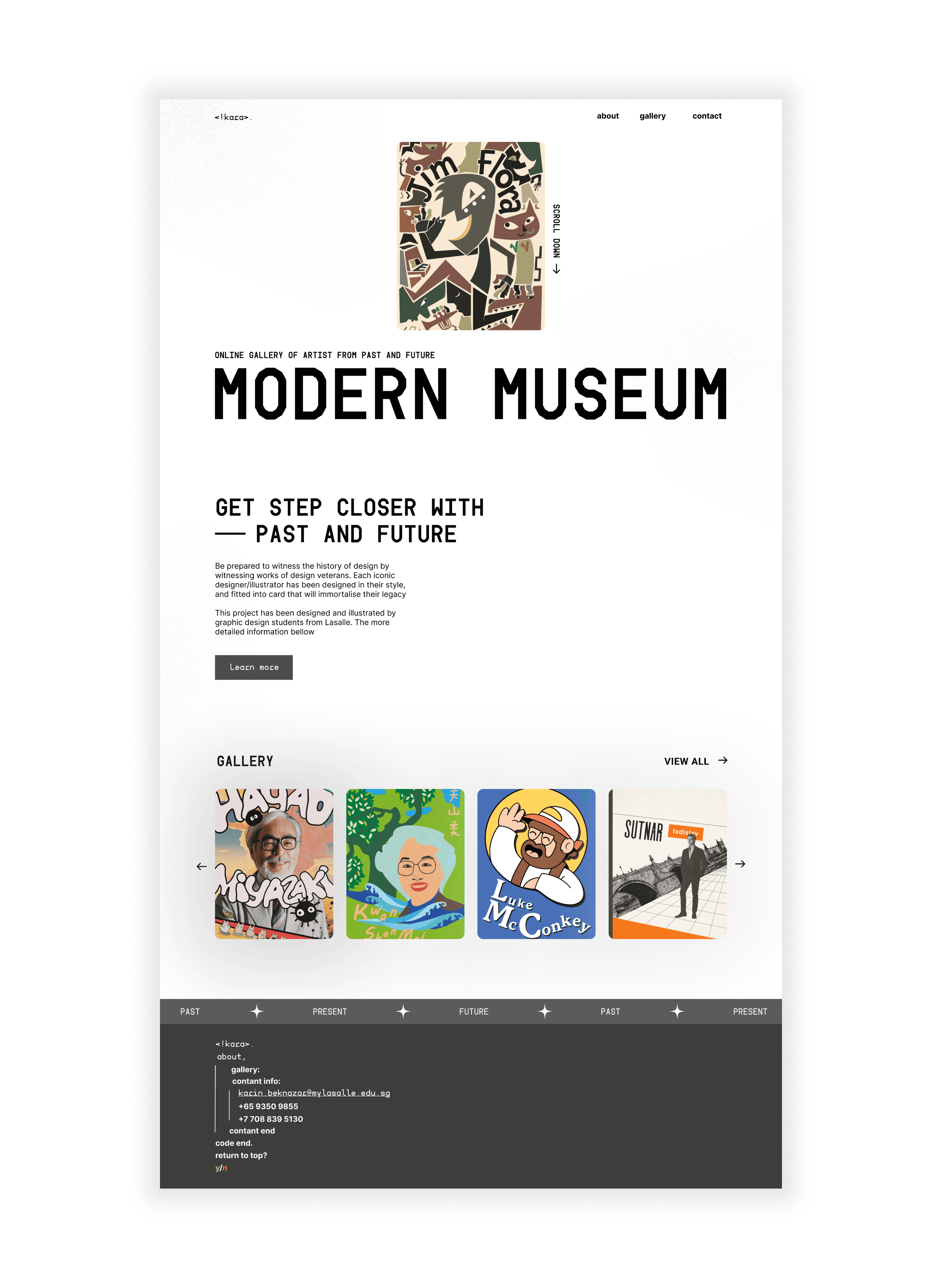
High Fidelity
In this stage, I started forming the design direction. Since the idea behind the project was to showcase historical designers across time, I thought it made sense to create a futuristic design. I wanted to make it futuristic to communicate the idea of a "time capsule." To complement this idea, I used this "Font" and for body text, I used Inter for readability
Homepage:
Click here to expand
Info Page:
Click here to expand
Gallery:
Click here to expand
Card Page (Front):
Click here to expand
Card Page (Back):
Click here to expand
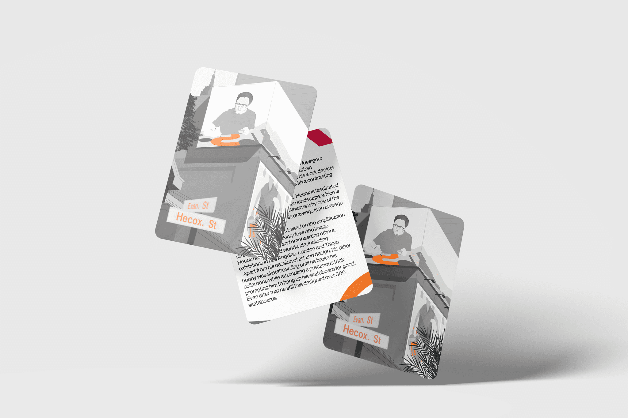
Trading Card
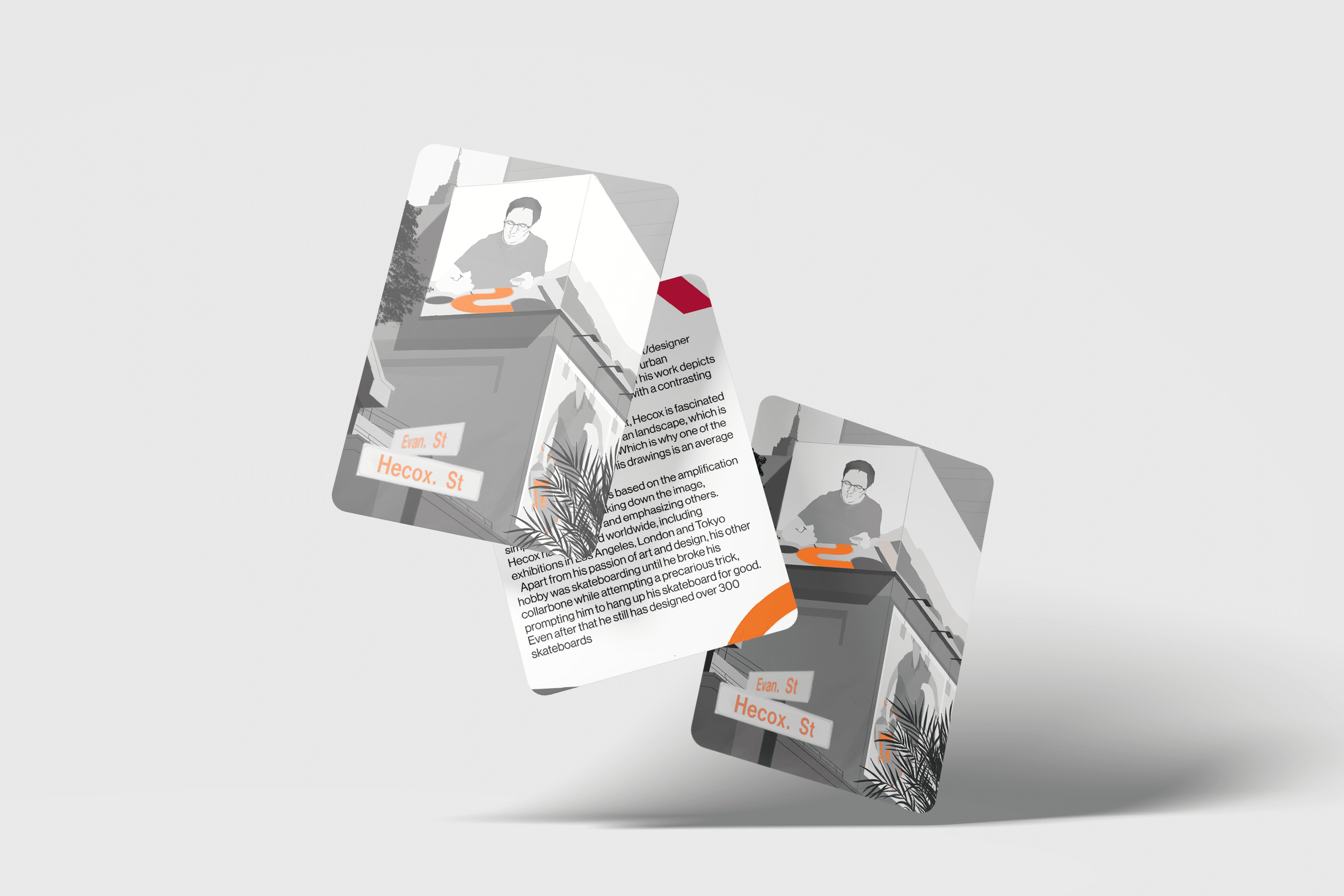
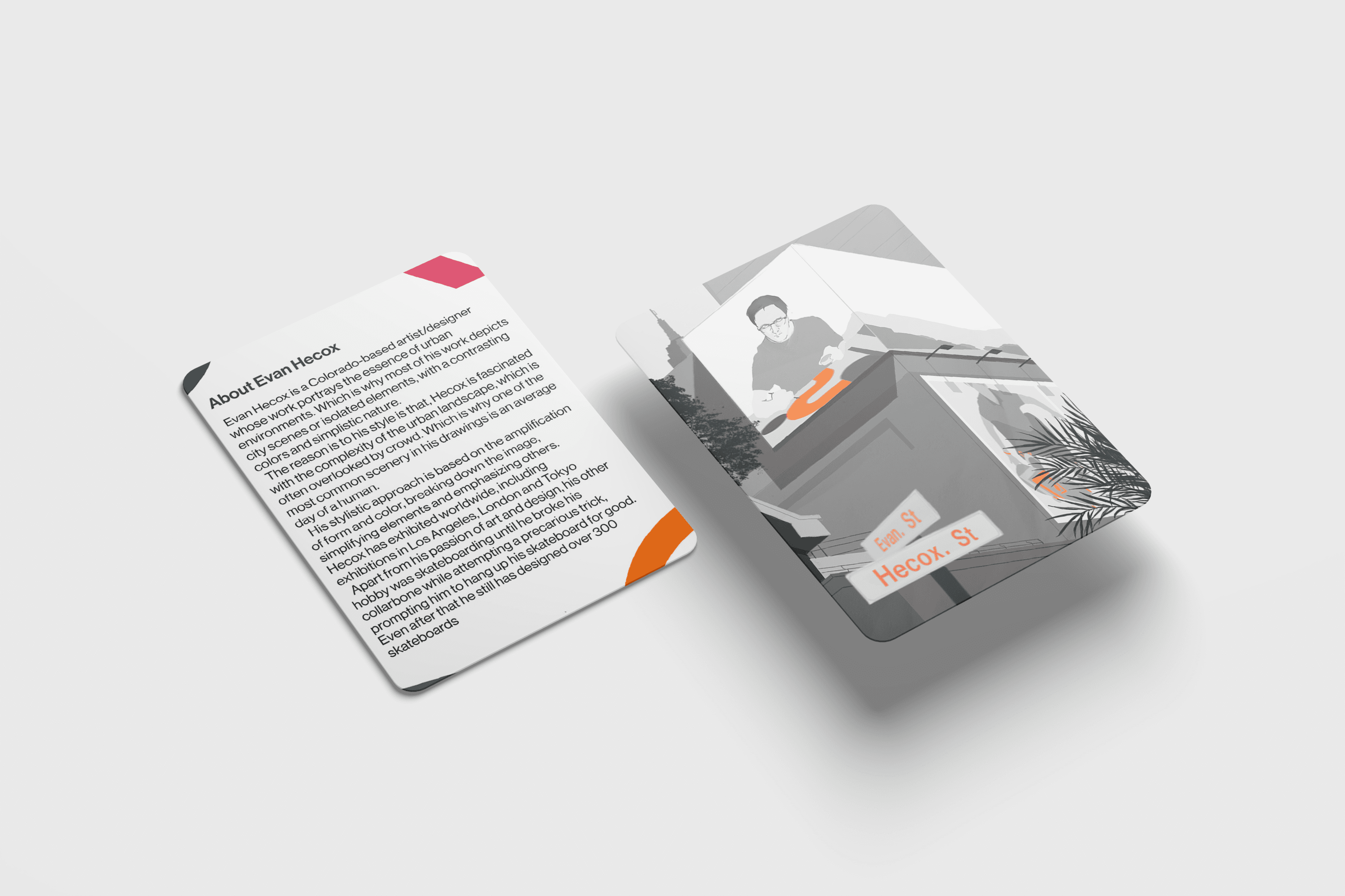
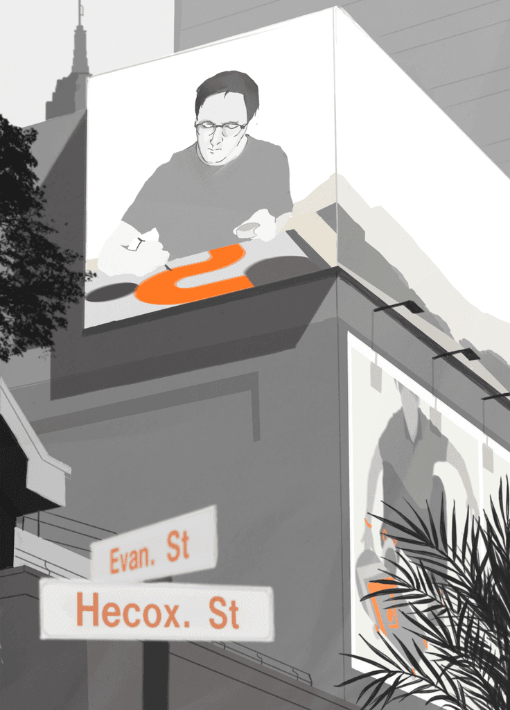
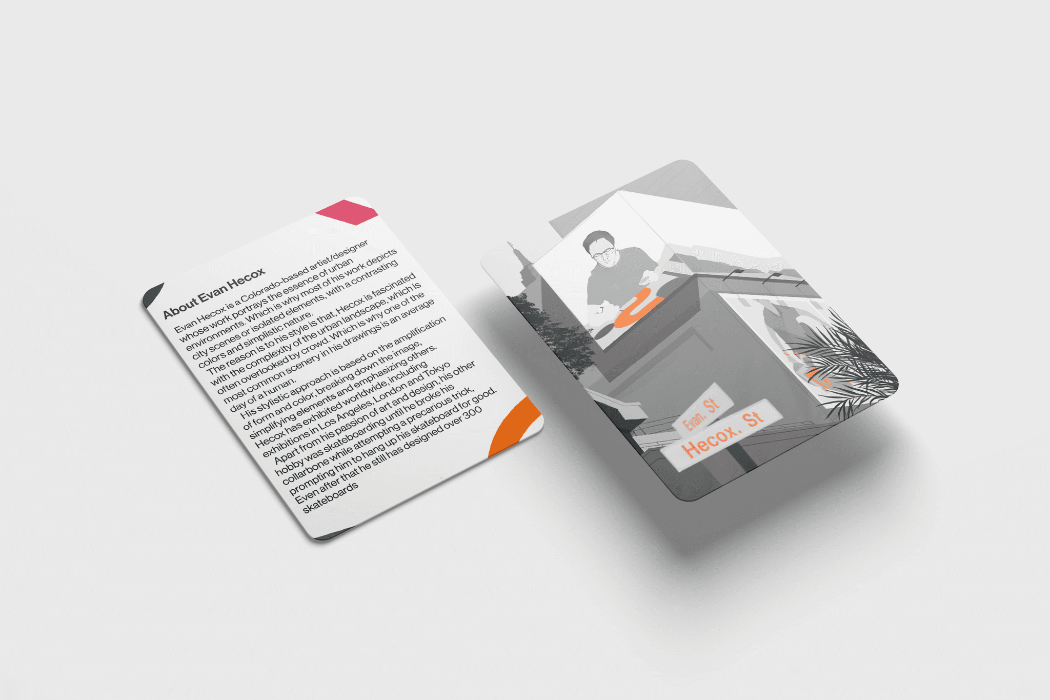
Last but not least, let's break down the trading card. My part of this project was to create the card for Evan Hecox.
Before designing a card based on a real person, it is almost essential to research that person in order to create a card that feels authentic to them. To do that, I researched who Evan Hecox is and studied his art style
About Hecox:
Click here to expand
His Artstyle:
Click here to expand
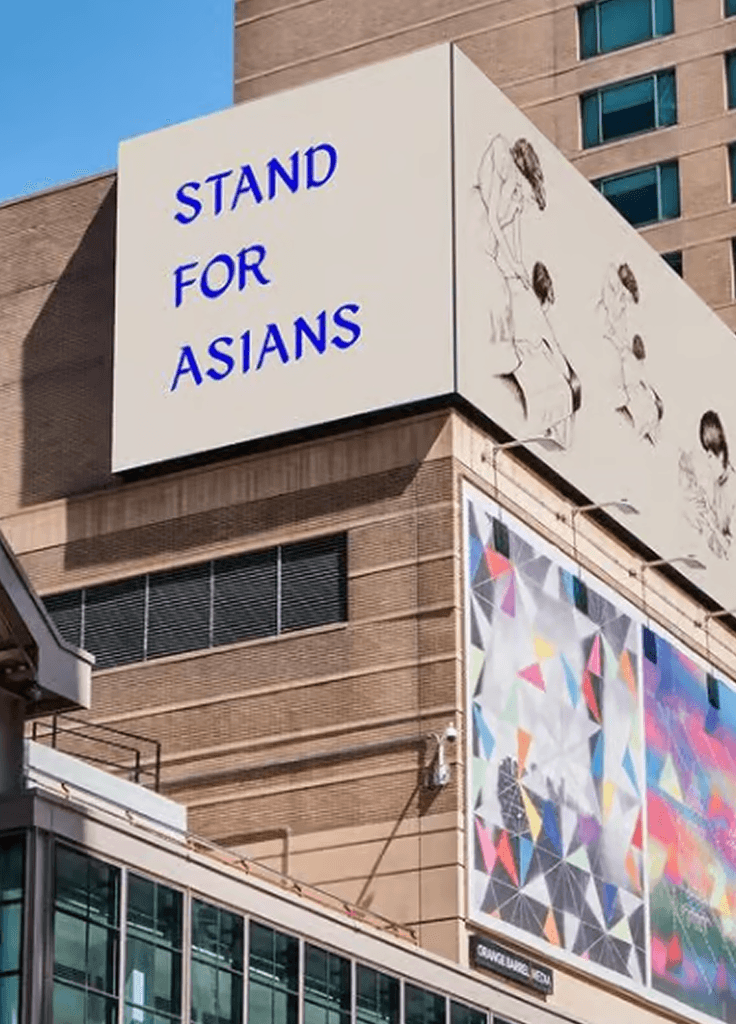
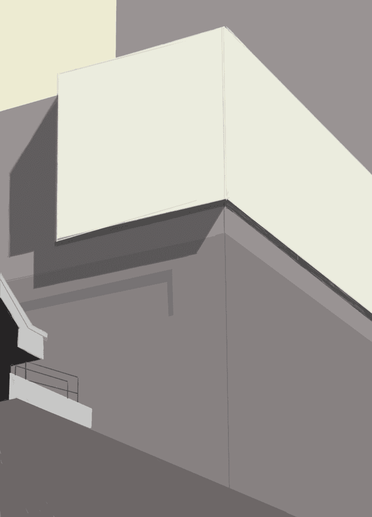
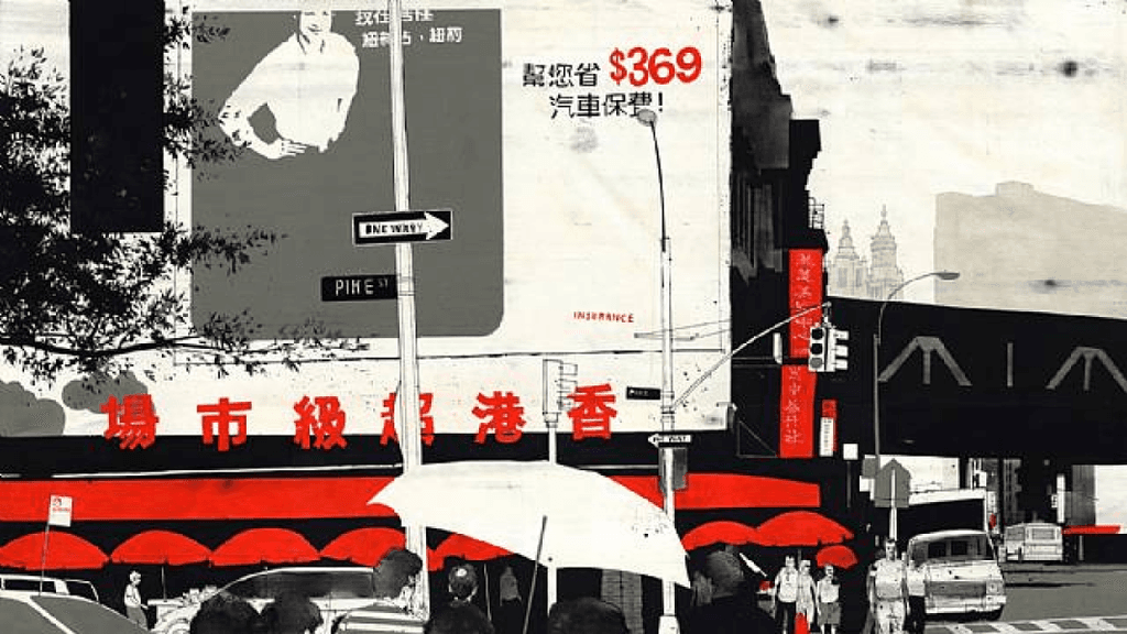
With the research done, I proceeded to break down his style. I referenced one of his most iconic works, Escape into Life. I realized that in order to replicate his style, I had to think more strategically. I started by simplifying a real image of Colorado into basic shapes and blocks. I chose Colorado because that’s where Evan is from. I used a limited color palette and intentionally avoided shading. The goal was to create the background using the fewest possible elements
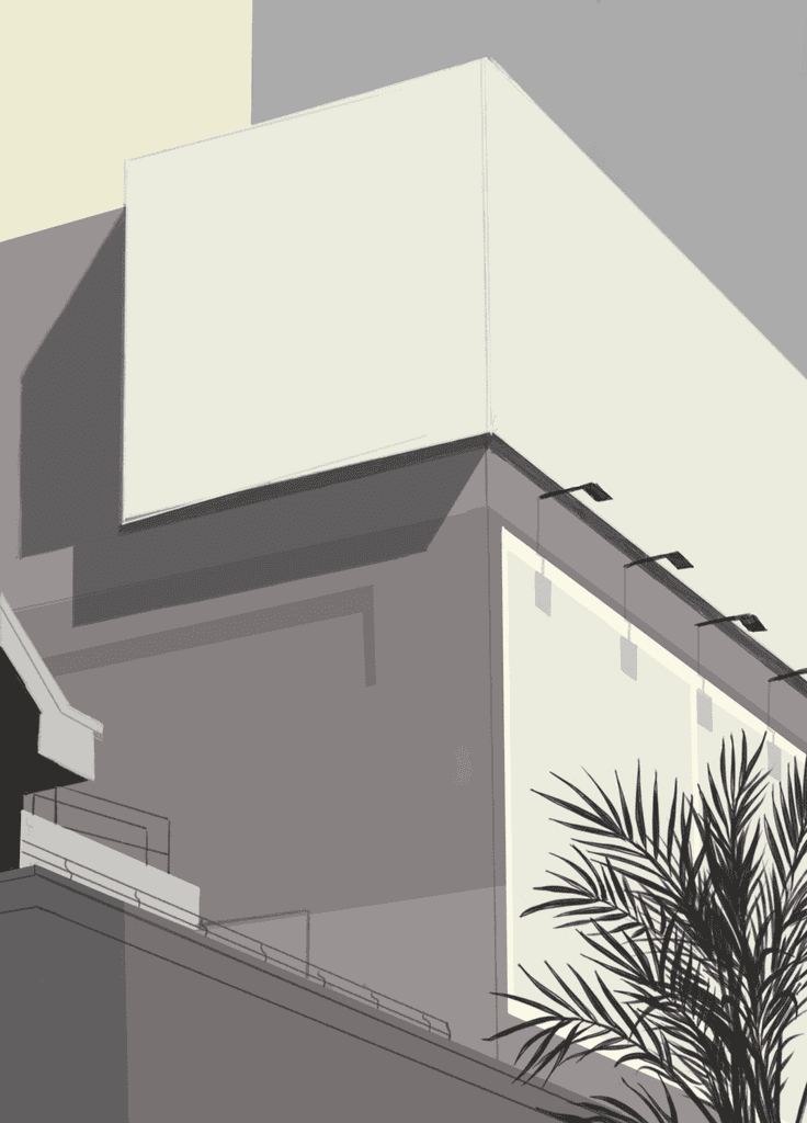
Next, just like Evan Hecox does, I added finer details in a later iteration. This creates a contrast between minimalism and detail, which makes the piece more visually engaging. I included small elements like staircase handles and lamps. To add depth to the card, I placed a tree in the foreground
Ideally, I would have stopped the illustration at this stage—I believe that would have been the stronger choice. However, because this is a trading card and we needed to reference the person, we had to include an image of him and add his name. Unfortunately, this meant introducing more detail. When there are too many details, nothing stands out. Still, I added a drawing of Evan Hecox creating his work, along with a street sign spelling out his name
Final Designs

Reflections
In this project, I challenged myself to grow as a designer by stepping out of my comfort zone. I realized that in many of my previous works, I tended to stay within familiar territory. This time, I made a conscious effort to explore areas I wasn’t as confident in
For example, I’ve never been particularly fond of fonts that prioritize style over readability. However, I learned how to incorporate them in a way that serves the communication needs of the design—without compromising clarity or the overall user experience
One of the biggest challenges I tackled in this project was illustration. To be completely transparent, illustration is one of my weaker areas. The illustrator I chose to reference, Evan Hecox, was not selected at random. As mentioned before, his work is heavily influenced by Bauhaus—a movement I personally admire. I saw this as an opportunity to not only improve my illustration skills, but also to complement and enhance my graphic design abilities
Looking back on this piece after a year, I’ve come to realize that I included too many visual elements. When you try to highlight everything, you end up highlighting nothing. If I could go back, I would remove the second drawing on the second billboard. This would allow the focus to remain solely on Hecox’s influence and bring more visual clarity to the design
To summarize, designers live in a fast-paced world where we are constantly being challenged. In order to grow—not just as designers, but as people—we have to be willing to step outside our comfort zones. I'm committed to continuing this journey, embracing every trial as a chance to become a better version of myself.
Modern Museum
Project type
UX/UI, Publishing
Date
April 2024
Tools
Figma
In this project, our goal was not just to create a website, but to design trading cards. The premise of these cards is to honor historical designers and illustrators throughout the history of design, ranging from the 1920s to contemporary creators, by creating a card performed in their iconic style
*See full case study on desktop/laptop version
Colors (Website)
RGB
Format (Website)
1920px (width)
Format (Trading Cards)
IPhone 13 & 14, 390 x 844px.
Colors (Trading Cards)
CMYK, 4C x 4C
Overview
Final Designs