Bi-Fold Booklet
Project type
Layout
Date
October 2024
Tools
Figma, Indesign
Overview
In this project, our goal was to practice layout and wayfinding systems by creating a bi-fold from an existing reference of the Singapore International Photography Festival.
To test our creativity, several limitations were set:
Format (Closed)
134(w)X190(h)mm
Format (Open)
268(w)X190(h)mm
Colors
Monochrome (B/W)
Images
Not Allowed
Font
Only One
*Refer images below for references
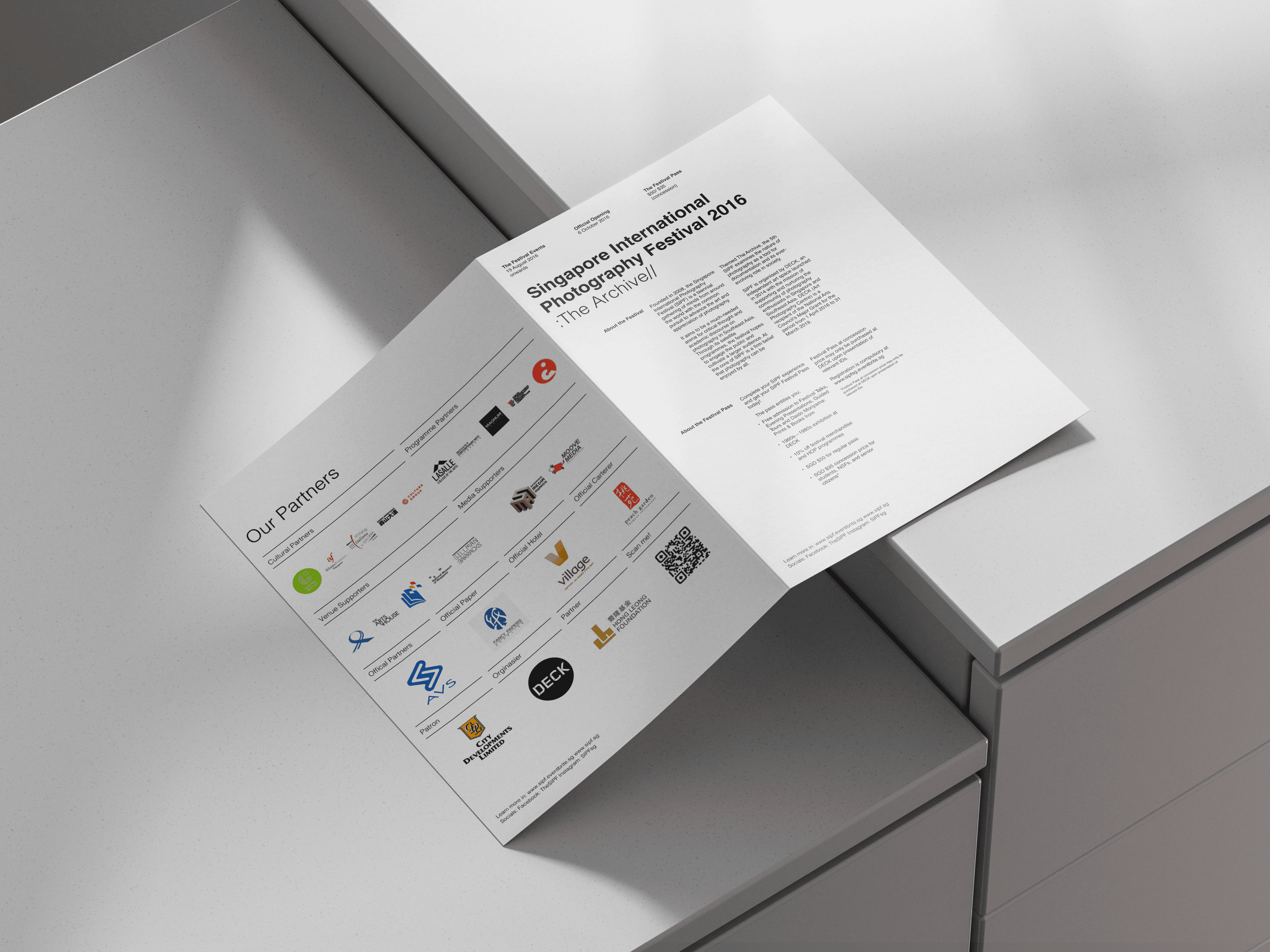
Reference
First Iteration
With the given limitations, it is hard to create visuals that are interesting to look at. Given the fact that there is a lot of text, I attempted to use the Swiss grid to amplify my design and improve readability.
By following all the canons of Swiss grid design, I created a 4-column grid. Based on Swiss grids, I made 2 key iterations:
Placing all content in the first 3 grids, with each group of text taking up one column. As an experiment, I tried making the layout more interesting by adding letters around
Dividing the columns into 2 parts. The first two columns were used for the title, and the other half for the informational text. To balance the text and title, I made the title as large as a group of texts without breaking the established grid system. This decision also created an interesting contrast while maintaining a sense of order.
Grids Off

Grids Off

Front/Back
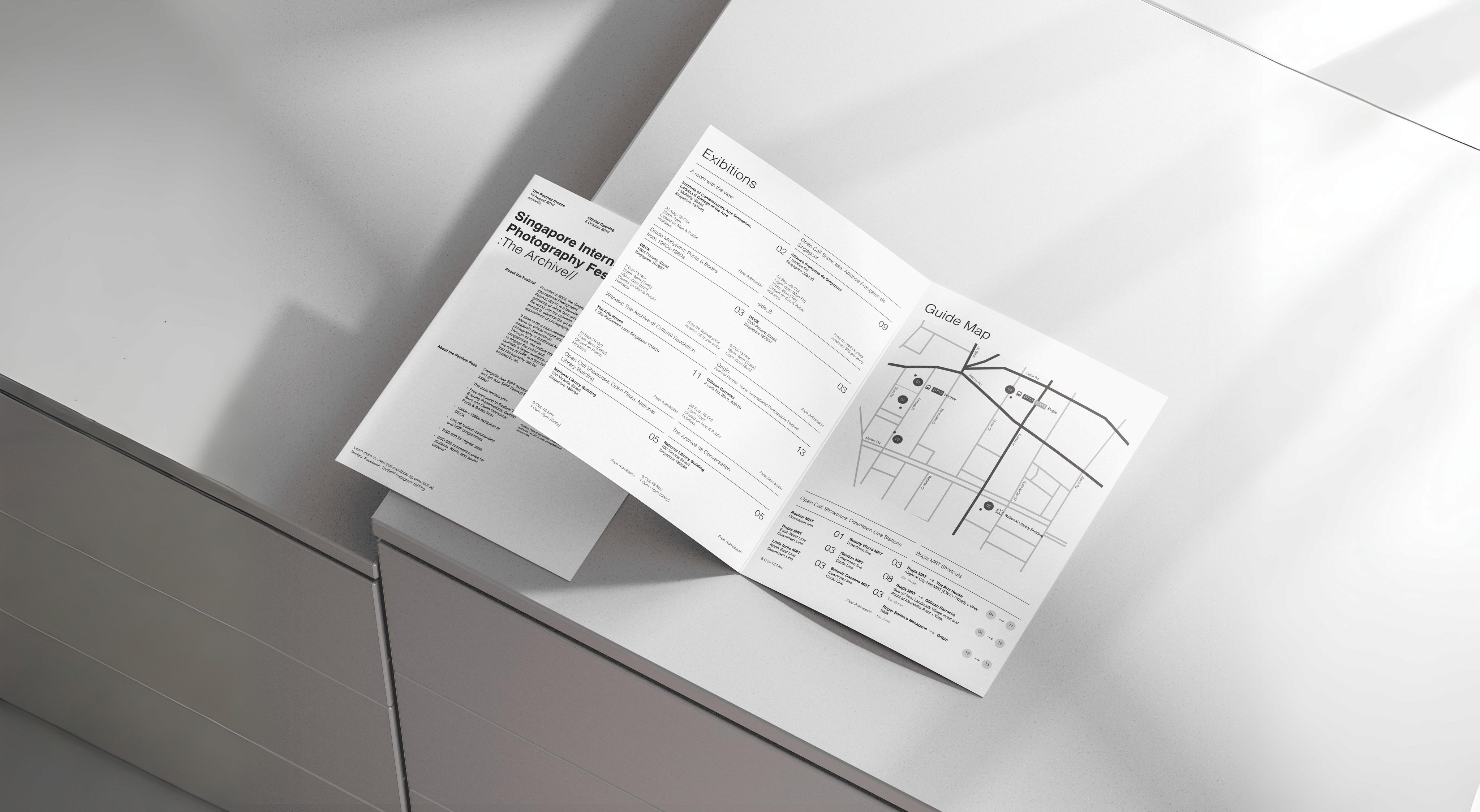
For the final design, I decided to go with the first iteration of the layout. The second layout has its own pros and cons, but I chose the first layout for the following reasons:
The first variation offers the most space for the text. However, if there were less body text, I would have chosen the second iteration
The second iteration, while effective, reduces the name of the festival the least.
When comparing the first and second iterations, the second one is more on-brand in terms of how the title is laid out.
Since the Singapore International Photography Festival is more commonly known as SIPF, it makes more sense to display each word line-by-line so that it forms SIPF when read line-by-line
Additionally, the contrast in the second iteration makes the visuals more interesting, and the symmetry of the weights creates an appealing layout.
Grids Off

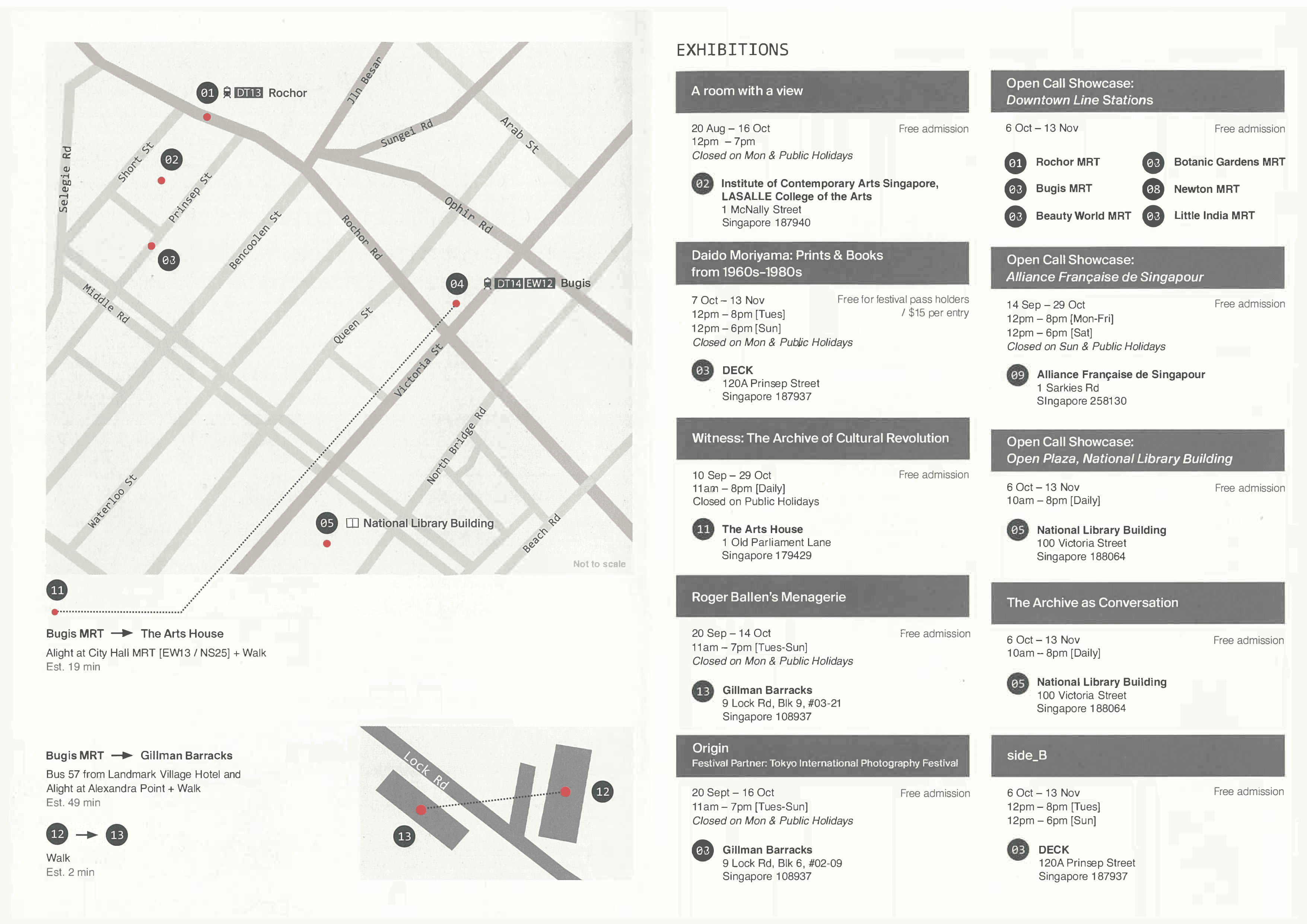
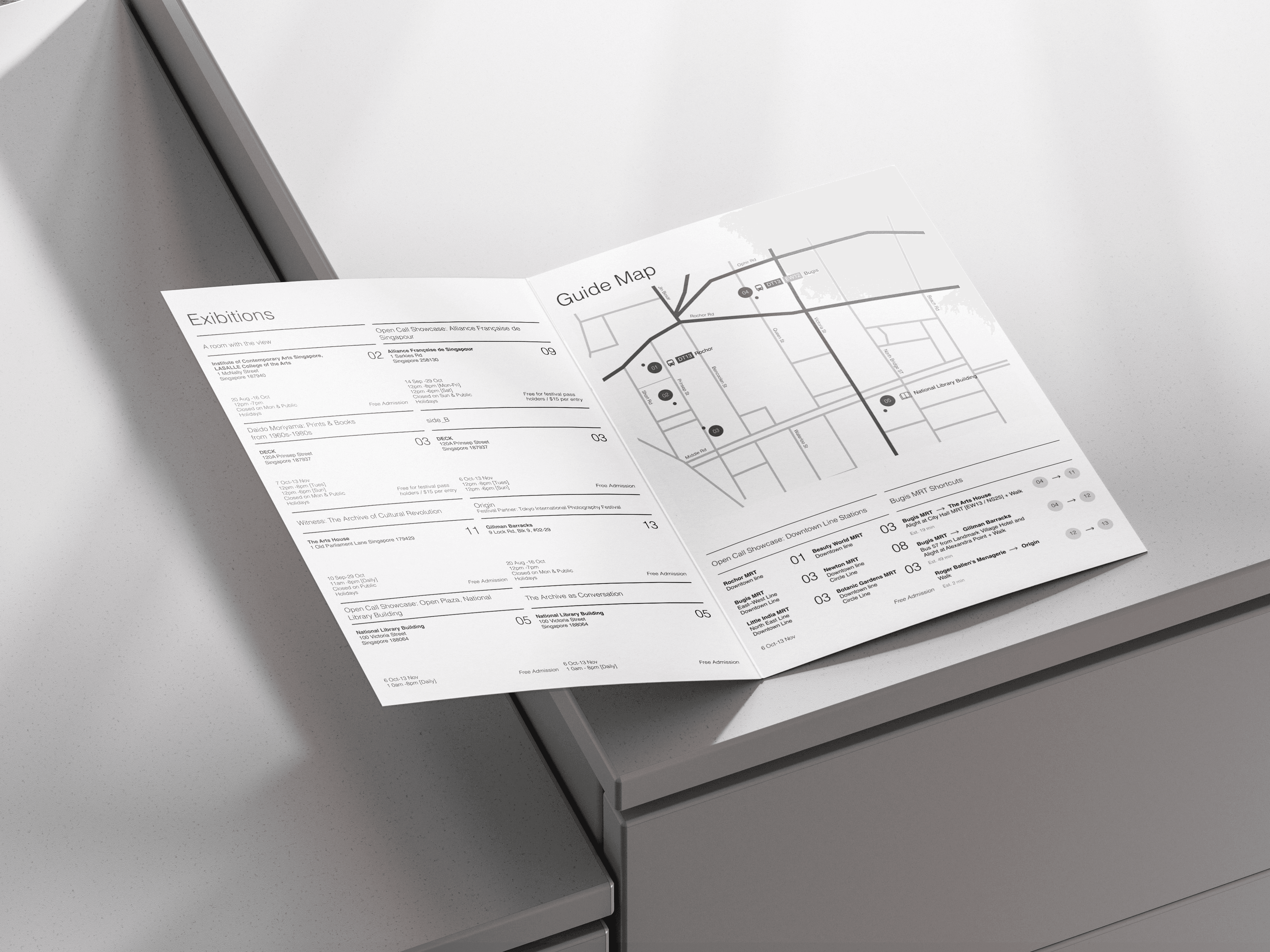
Map
The most important part of this project is building a wayfinding system. Creating a map requires patience and a deep understanding of user needs. Since the booklet is mass distributed, I assumed it is targeted toward a broad audience. Therefore, on average, it should be kept minimal and non-experimental to ensure that as many people as possible can be converted into consumers
At first, I wanted to use someone else's map, but creating my own map would help me grow. Nonetheless, as a skeleton for my map, I used someone else's map as a reference. However, the small details in the map didn’t align with the rest of the visuals in the booklet, so I removed everything except the roads to make it feel more polished
To ensure the map remained clean, I kept the stroke width consistent. To highlight the main roads, I adjusted the width and contrast
The tricky part was the text. The placement of horizontal text was quite straightforward. However, placing vertical text posed a challenge: Should it go from top to bottom, or from bottom to top? I couldn’t find a definitive answer online, but based on my preference, it’s top to bottom. My reasoning for this is that it’s easier to lower your head than tilt it upward
Black Mode
Info Table
Last but not least is the information content table. I really liked the layout of the info cards in the reference, but it could use some reimagination to fit the overall feel of the booklet I have designed
First of all, instead of using thick gray boxes for the location names, I removed them completely and added strokes instead. There are several
reasons why it was essential for the booklet:
Click here to expand
The second difference is how the card takes up 2 columns, with the information divided into 1 column each. Of course, some content extends beyond the column, but the majority follow the established grid
To help with this, I removed the numbers on the left of the address and placed them in the second column. The relationship between the address and numbers is still the same, and now every text is perfectly aligned on the left, which helps with skimming information faster
Lastly, to make the layout cohesive and to make skimming even faster, I ensured that each content table is approximately the same height. To achieve this, I selected the smallest and largest title cards and created an average title card size based on them
The cards that were too complicated and couldn’t be averaged out were placed near the map. It was much easier to average out the remaining content tables rather than averaging them with every other table
Grids Off

Final Designs
Reflection
The reason I chose this project as one of my portfolio pieces is that I learned quite a lot about layout. Creating layouts is less about keeping order and more about understanding the needs of the user. Throughout this project, I put myself in the shoes of a consumer. For example, I made the layout simple and clean because, as someone who would use the booklet as a wayfinding system, I would want to use it as often as possible. Refinding the same spots over and over again would be inconvenient, so I aimed to create a layout that the average brain could memorize after some time of using it
Another thing I learned as a designer is the importance of leaving the comfort zone. This project had many limitations in terms of imagery and colors. Our first instinct is to rely on visuals to make the design interesting and use colors for contrast. But during this project, the limitations helped us come up with unusual approaches. For example, I would never have used the Swiss grid and based my design around it because I was too afraid to leave my comfort zone. This made me realize that true creativity emerges during limitations.
Bi-Fold Booklet
Project type
Layout
Date
October 2024
Tools
Figma, Indesign
In this project, our goal was to practice layout and wayfinding systems by creating a bi-fold from an existing reference of the Singapore International Photography Festival.
*See full case study on desktop/laptop version
To test our creativity, several limitations were set:
Colors
Monochrome (B/W)
Images
Not Allowed
Format (Closed)
134(w)X190(h)mm
Format (Open)
268(w)X190(h)mm
Overview
Final Designs