Clair
Project type
Branding
Date
October 2024
Tools
Photoshop, Figma

Overview
In this project, our goal was to create a satirical product with social commentary, delivered through distinct branding and visual packaging.
With the rapid rise of social media, the unhealthy trend of exploiting people’s insecurities as a marketing tool has also been on the rise. The satirical skincare brand Clair is a commentary on this trend.
Our goal is to spread a message through satire: Clair believes that it doesn’t take skincare to be content with yourself—only that you need to "be transparent with yourself"
Ideation
Before beginning to design my first concepts, I started with ideating ideas around the packaging
In order to make satire of modern beauty companies, I have came up with an idea of a "placebo" cream that makes your skin more beautiful
The message behind this cream is that if you find yourself beautiful after using "Clair", all you really needed to do is to be: "Transparent with yourself."
Thats where I came up with the name "Clair" or "Transparent"
Next, I started ideating different design directions to enhance the core idea behind "Clair". I came up with various visual themes: Pharmacy (Left Top), Luxury (Left Bottom), Clarity (Right)


First iterations
At the end, I came up with an idea of combining the themes of luxury and clarity. The pharmacy-themed packaging would make the satirical messaging either too clear or too confusing
However, I found it important to highlight the fact that the majority of beauty brands that promote toxic beauty standards are often luxury companies
That’s why, to make my messaging more effective, I decided to make the packaging look luxurious by adding an elegant font and including luxurious “buzzwords” in the description. The message “To be transparent with yourself” is a clever wordplay on the name Clair, which means “transparent” in French and sounds like “clear” in English.
It would be a shame not to utilize such a coincidence, which is why I placed emphasis on clarity and transparency.
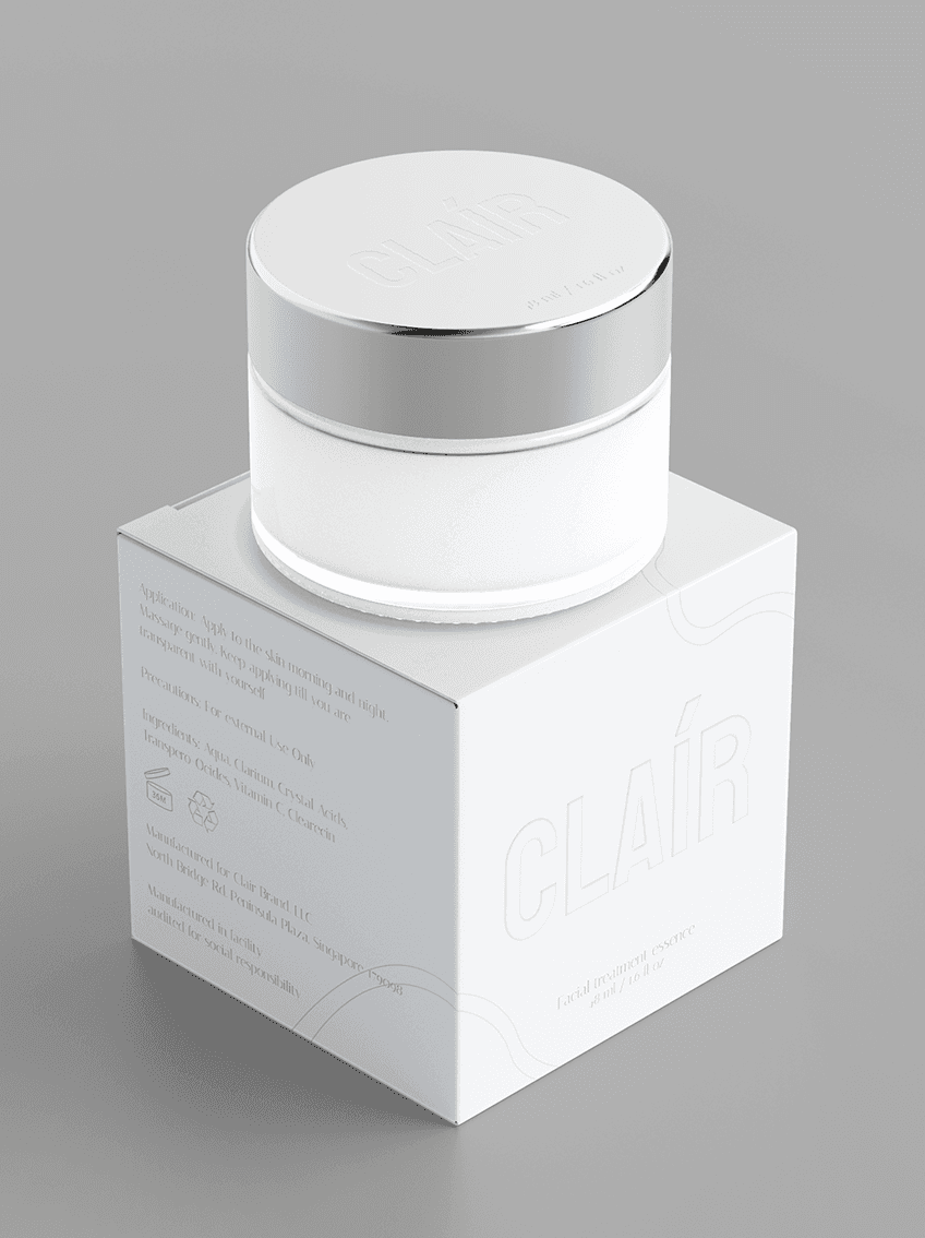
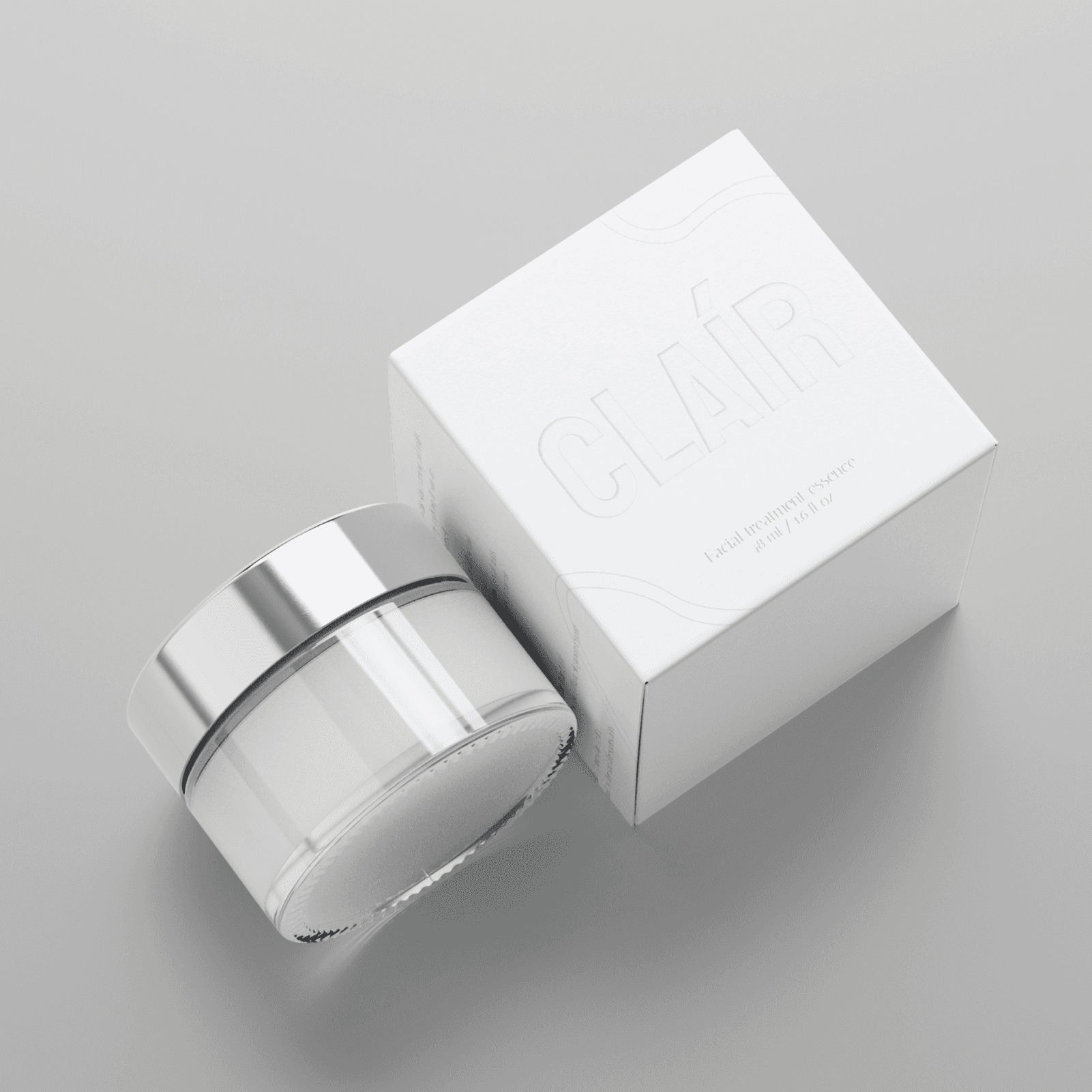
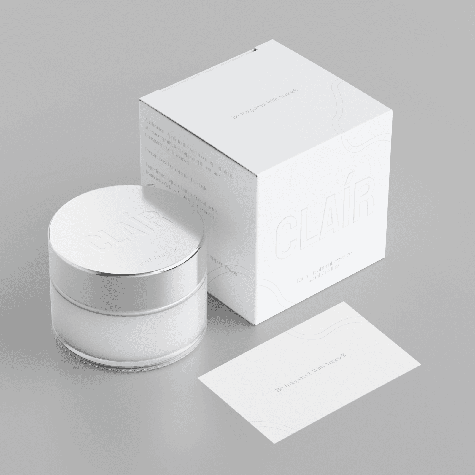
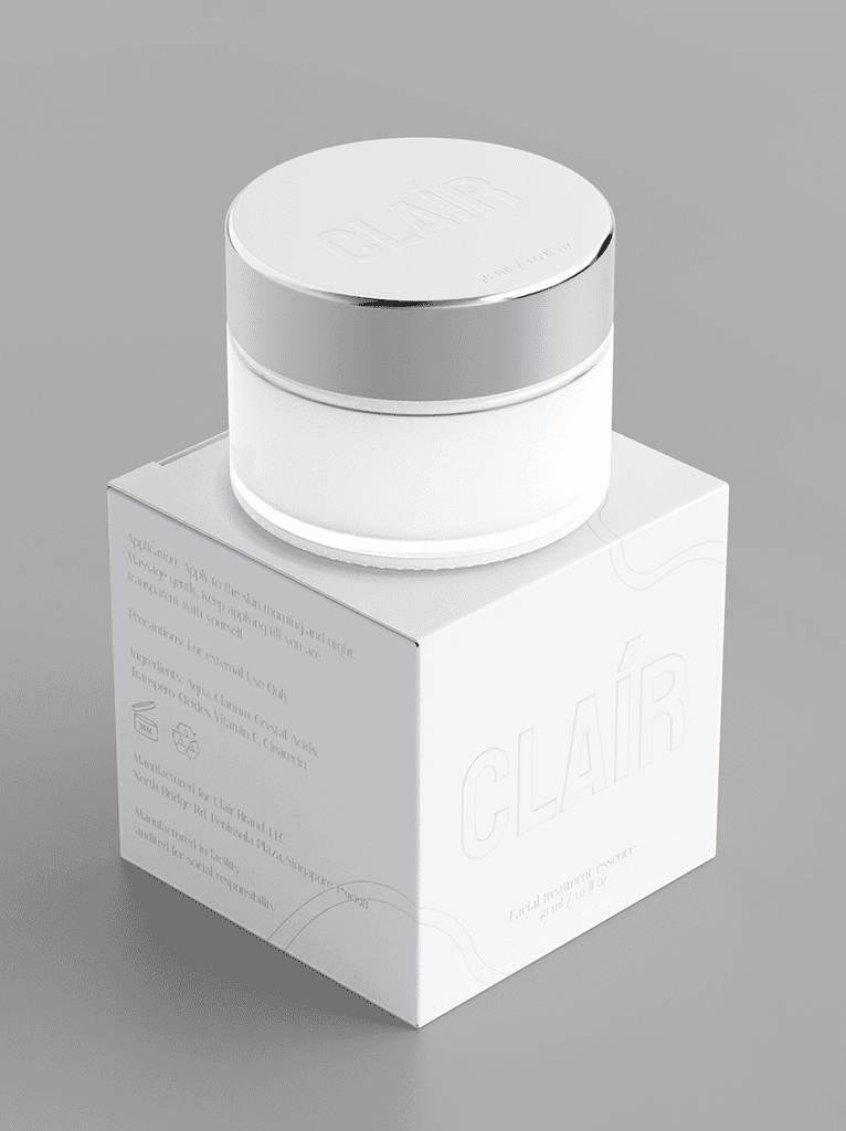
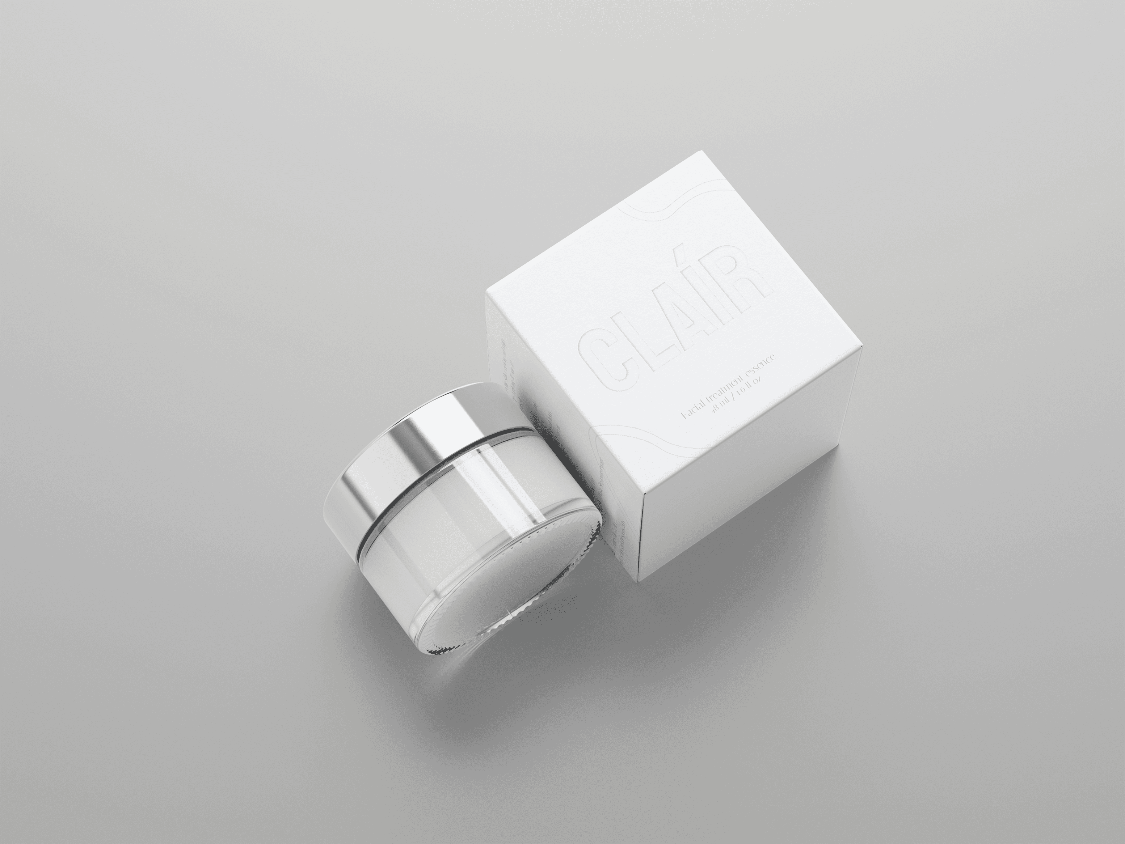
I embossed the word Clair on a plain white surface to give a feeling of clarity and transparency, which also made the packaging more luxurious.

Direction
I continued with a similar direction to the first iterations, but I decided to fully emphasize embossing to highlight the theme of clarity
This is why I removed all black text from the cover, and every element is embossed to make the cover look and feel transparent and clear.
Labels were avoided to make the visuals more immersive without disrupting the flow of clarity
That’s why the metal cap has been embossed with the brand’s name, and the measurements are debossed on the bottom
To make the packaging more unique, I added curved lines that resemble water, without adding excessive elements that would disturb the clarity.
Lastly, I added a complementary card to convey the message behind Clair.
Final Designs
Reflection
The reason behind why I find this work particularly interesting is that I have put a certain amount of self-reflection into it. Working on this project gave me a chance to talk about stuff I truly care about. As many other people on this planet, I am quite self-conscious about how I appear in front of others. After some self digging, I came to the realisation that all I have to do is be transparent with who I am. That little acceptance in yourself is one step in person's authenticity
As a design communication student, it's a reminder for me that we hold the power to communicate the ideas that we have through visuals and this is my attempt to use design to communicate my values to others.
Clair
Project type
Branding
Date
October 2024
Tools
Photoshop, Figma
In this project, our goal was to create a satirical product with social commentary, delivered through distinct branding and visual packaging.
With the rapid rise of social media, the unhealthy trend of exploiting people’s insecurities as a marketing tool has also been on the rise. The satirical skincare brand Clair is a commentary on this trend.
Our goal is to spread a message through satire: Clair believes that it doesn’t take skincare to be content with yourself—only that you need to "be transparent with yourself"
*See full case study on desktop/laptop version
Overview
Final Designs